Yeah, we don’t have front doors like this in NYC.
The more I read home staging tips, the more I think: life is just different in New York City. There are things people recommend that we can’t do here. A gussied up front door, for example. That’s just an invitation to steal a bunch of stuff. We can clean the hardware, for sure, but to add planters, accent pieces, and something to draw the eye — all a very bad idea, and if your unit is 8H, for example, pretty pointless.
Here some other home staging tips I see that make me nuts. This is just not good staging. It may be an idea that works in your certification designator’s home town, but really, do not try it here in NYC.
- TOO MUCH – tables set for 10, entire recipe ingredients laid out on the cooktop, ALL of the 1,000 puzzle pieces, open scissors on a bit of tapestry/embroidery
- Hiding Major Defects – hanging a large painting over a crack or water damage section
- Fake Food, Fake flowers, everywhere… who eats a bagel in the bathroom, seriously? There’s morning kitchen and then there’s this apt’s too small for a morning kitchen, so let’s eat in the real one with the fridge in it.
- Bible on the bedside table. No. Not a hotel, nor even a Motel 6. Not funny.
- And so many more “charming touches” that are just ridiculous! – a pile of boiled books, tied up with string is another favorite of my pet peeves.
But here are some good ideas we can utilize, from FrontDoor.com’s Room by Room Staging Strategies —
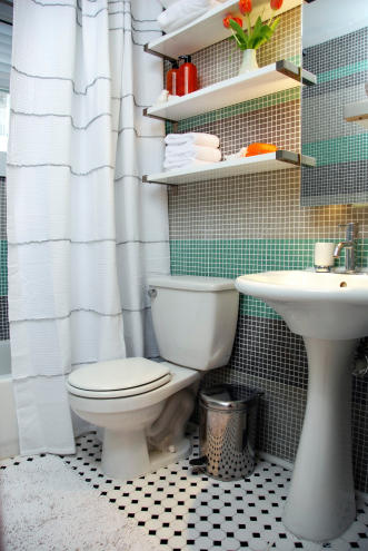
1. Replacing the grody, disgusting vanity with a pedastal sink is an idea worth merit. It looks better, and is a cheap fix. BUT not in New York City. storage is a huge issue for us here. A new vanity from Home Depot, with perhaps glass sink perched on top – now that is money well spent. “But it’s half the price, the pedastal sink,” pleads my assistant with a keen eye to the budget. “Vanity,” I insist. And that’s that.
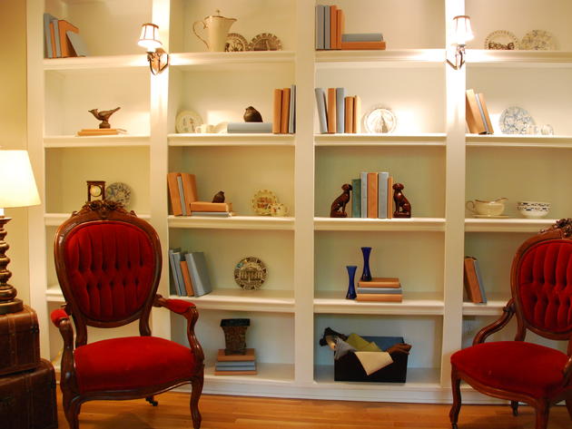
2. Buyers love built-in bookshelves, but they need to accessorized to stand out. It’s not like you have to cover your books in wrapping paper and go crazy here, but a single, neutral palette will go a long way to making them look elegant and able to handle a lot of stuff. No one piece should stand out… and if you can get an electrician in to put a bit of lighting either under the shelves or on the outside like the sconces here, you will find the space looks bigger and almost designer-ish.
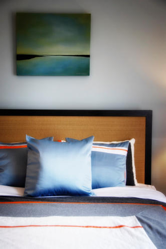
3. Always add a headboard. I can’t tell you the difference this makes. Even if all you add is an old door or piece of architectural detailing as a space marker. This finishes the room and elevates the room from college dorm room or squatter’s toss-spot to grownup space and with nice bedding, perhaps, serene retreat. At least, that’s what you should be aiming for.
Here are some other ideas from the Twitterverse —


