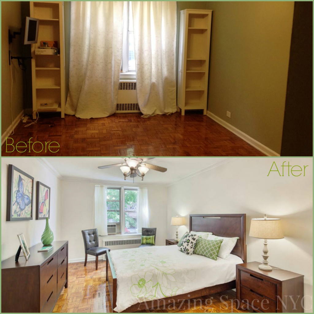
Staging Is Not Just Furniture!

Home Staging NYC Estate Sale

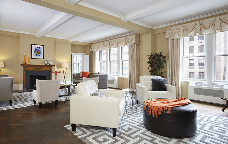
When Amazing Space NYC arrived at this estate sale, there were bookcases in the living down one long wall. We knew the room would look bigger without them, so removed those bookcases. Only to reveal a wall that was not only discolored but crumbling in areas.

Staging is not just furniture; we had to let buyers see that this estate was not only loved and lived in but also maintained.  Buyers see cracks and crumbles and worry that there must be water damage from leaks.  We repaired the wall and made it part of the library / lounge side of the oversized living room. But at 31′ wide, this is a hard room to imagine usable. Where do you put your furniture, how do you furnish the double room so that it doesn’t just look like the place you sit in hotels when your room’s not ready.

Living Room

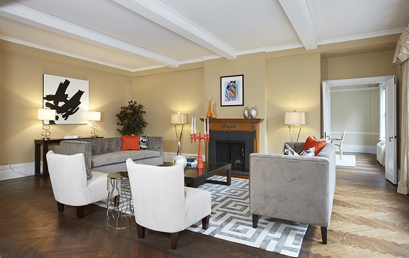
Other half of Living Room

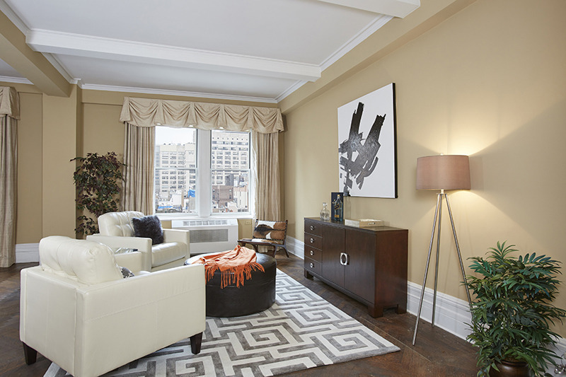
Staging is not just furniture

Notice the unifying pops of orange.  Nothing too strident, but bold and fun.  As is the hide side chair.

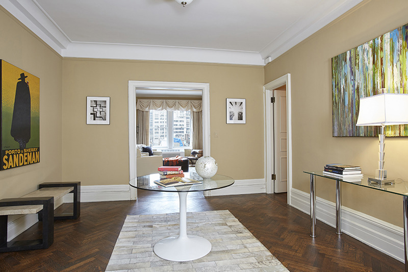
In the foyer, we added transitional pieces, with a variety of art, typical of our intended target buyer.

Foyer

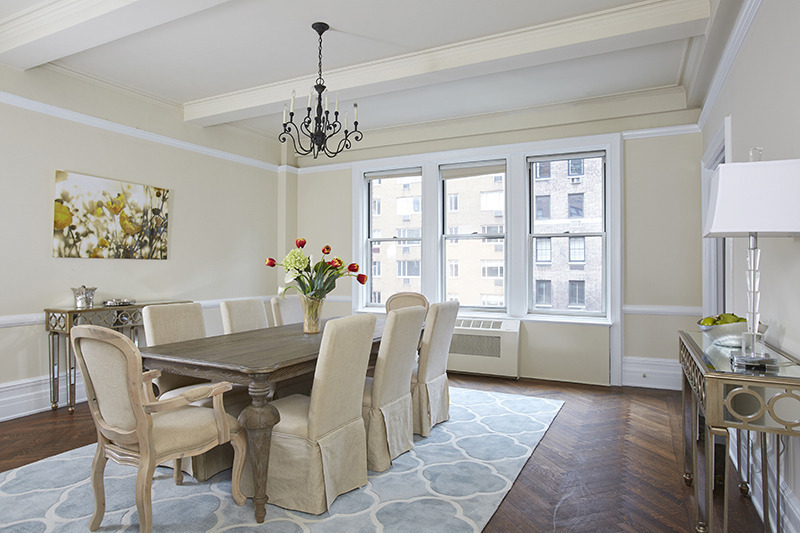
The dining room used to have Wedgewood blue trim and window frames with heavy blue toile or damask drapes.  We lightened up the room with a new paint job and allowed buyers to see out the windows and enjoy the natural light.

Formal Dining Room

125 East 72 Street 9D is now under contract. There was an accepted offer and a contract issued within 4 weeks of releasing the staged property. That deal fell through but another buyer jumped in shortly thereafter.

This is a great example of making the first rooms the buyers see create the tone, the mode, the “this is what the property can be  if . . . .”.  And it worked – again!

http://www.bhsusa.com/manhattan/upper-east-side/125-east-72nd-street/coop/10920325
 

Bracing For The BlackOut? Call A Home Stager for GREAT Last Ditch Ideas!

Reinforced by a great article in NewYork , we know that Real Estate Brokers generally think (and tell their clients): “If you’re looking to buy for a bargain, then start buying in November and stop buying end of February. When sellers see very few showings or very few people attending an open house, then a buyer can put in a low offer and it will get accepted,”   The article goes on to suggest that ” sellers, too, can benefit from a reduced marketplace as well, especially if theirs is the only type of home on the market in that particular area.”

However, if you’re still looking for a buyer, now IS the time to panic.  If you don’t do something immediately, then you will be low-balled or black-balled and neither one helps you move on in a good way.  What to do?

Something Bold.

  1. Be honest with yourself. Too much furniture? Take 90% out, and leave only the “mod” pieces. So long as they are in mint condition.
  2. Bright color.  You want your frame to be neutral, but not necessarily beige. We have done very well this year with a pale gray or taupe as our neutral and then amped up the space with bright teal, or red, or yellow.
  3. Different art.  When you sell your property, the bigger, stronger pieces make more of a statement. You only need one on a large wall, and you’ll find the whole space looks and feel hipper, edgier and more inviting. Counterintuitive? Yeah, but it works.

Something Soft and FluffyHome Staging NYC one57 condo

  1. A pillow
  2. A rug
  3. A throw

Winter’s coming, nights are drawing in, and people are naturally nesting in for the colder weather. Just a touch of fluff will give you a texture and an invitation to snuggle. That’s all you need.

ReshootBrooklyn Home Staging for a rental appartment

  1.  Have your photog take more intimate shots as part of the montage that is uploaded to Street Easy and the Broker’s webpage.  The wide angle lens is not sexy; it does not add warmth or sensuality to the room. While I understand that buyers needs to see the breadth of the space, adding a few intimate close-ups will make the listing more attractive and memorable.
  2. Look at the photos for some of the new builds in your neighborhood. What are you competing against?  Notice if the photos are stylized at all, and how the tint is just a little bit “more” than the space would look in real life. Do the same. Personally, I’m finding that grayer, cooler photos are looking more on trend than the yellow tones of the Pottery Barn Thanksgiving catalogue. Think: Restoration Hardware.

Lastly, do NOT reduce the price. Fix the value.  If you haven’t sold your house already, don’t immediately take a precipitous hair cut to make your broker’s life easier. Get hold of a stager and see what can be done to better tell the story of how your space works.  And hurry!

It’s not only Black Friday that coming, but the blackout time of New York City Real Estate season. Btw, I’m at 917-428-3965, but not for long: I host Thanksgiving.  As you might imagine with an Italian hostess, it’s a non-stop feast!
________________________________________


Staging in Brooklyn Heights: Rental Leased Within 2 Weeks!

Brooklyn Rental Staged and Sold


Brooklyn Heights is the IN place. Full of construction, there are new towers and prestigious buildings with a plethora of amenities popping up throughout the zip code.  Competition is fierce and usually the “newest” – because whichever has the caché of being the “newest” rents the fastest.  The marketing director of a management company for several very prominent rental buildings in the Heights and Dumbo areas realized the dilemma one of her buildings was facing and called our company to stage three units – a first floor studio, a one bedroom and a 2 bedroom unit.

A staged property

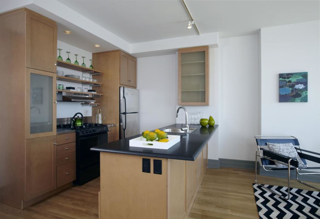
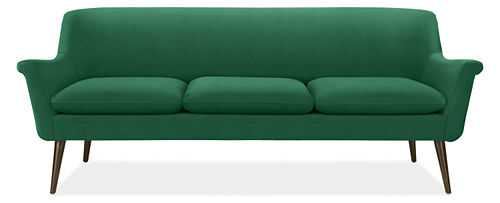
Vintage green glass speaks volumes to the stylish Brooklyn set.   For the one bedroom apartment, our backdrop of black and white was invigorated with green and yellow.  We absolutely love the lines of this velvet green sofa from R&B; paired with a white leather wasilli chair, black and white chevron leather rug and a combination of black/white and solid yellow pillows, this room screamed “Welcome”.  The vintage green glass displayed on the open shelving in the kitchen was the perfect touch to complete the color scheme we installed in this open floor plan design.  The Client had a little concern about the boldness of the sofa, but when the unit rented 2 weeks after it was released, I think she was okay with our design choices.

Green Sofa

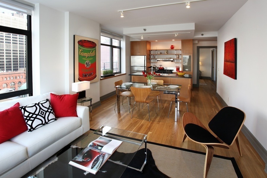
The first Unit we staged was the 2-bedroom and we went bold – black, white and significant pops of red to really make the unit come alive both in photography and in person.  Within one week, the apartment rented!   All of the furniture, art and accessories were relocated to another 2 bedroom vacant unit with a slightly different lay-out.  That, too, rented quickly – within 2 weeks.

Andy Warhol’s Campbell Soup Cans takes iconic imagery and turns them into subtle tells of lifestyle and values.  It must be odd to have your entire career be defined by something as quotidian as a Campbell’s Soup Can.  Even more odd that painting over a photograph was considered the height of a new form of expression.

Reflecting on his career, Warhol claimed that the Campbell’s Soup Can was his favorite work and that, “I should have just done the Campbell’s Soups and kept on doing them … because everybody only does one painting anyway.”    [Phaidon.]

He might have been on to something – considering that one iconic piece of artistic expression garnished $9,042,500 at auction!

We love staging in Brooklyn; give us a call!

Related Brooklyn Rental Staging

Staged Penthouse Colors The Upper West Side For Sale

home staging the upper west side

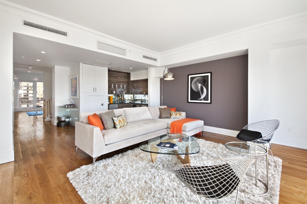
This Penthouse apartment on the Upper Westside was a giant white box that offered a lot of space . . . . and white walls . . . .  and space . . . .  and more white walls.  It lacked sex appeal, and did not offer  any ambiance.  Working with a very limited budget, the marketing team decided to stage the main living/entertaining space in an effort to create a WOW moment as soon as the elevator doors opened on to this floor through showcase.  The team wanted a design plan that was more downtown – vibrant and loft-like. More and more younger buyers are recognizing the value of the UWS (as is written in this recent  New York Post article, and the Sales and Marketing team wanted to capitalize on the movement north.  In order to capture this target demographic buyer, the Penthouse needed a more contemporary aesthetic, not the stodgy “Old New York” décor that is so familiar in the UWS pre-war apartments.

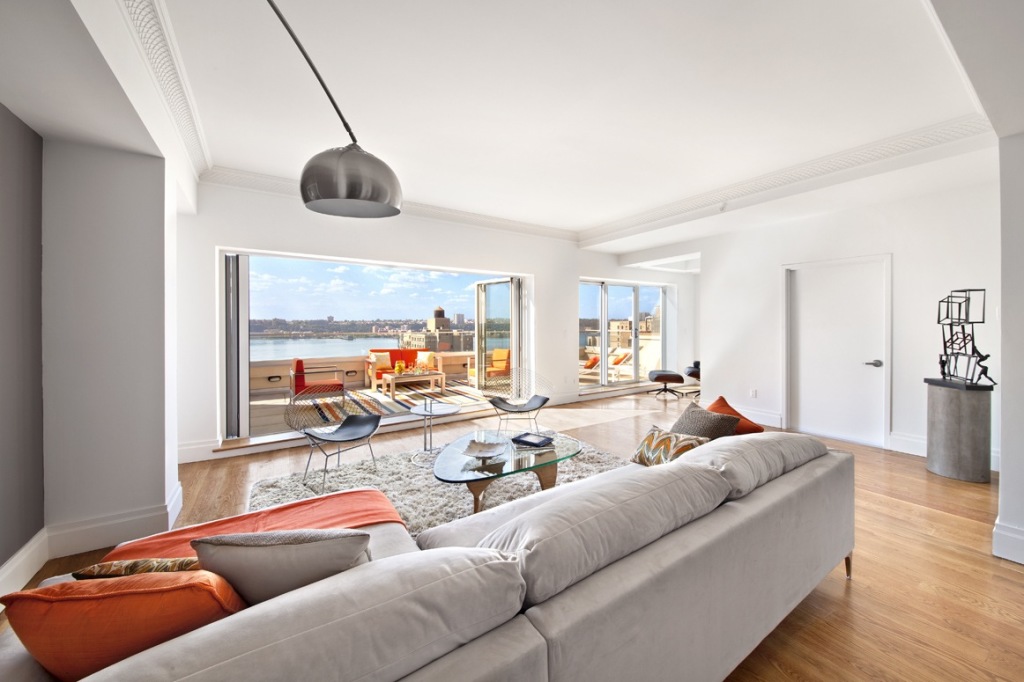
We added an accent wall of deep mocha-gray accent wall in the living room, then accessorized with orange for downtown punch. The accent color carries through to the oversized terrace, making the living area feel twice as grand and without obstructing any of the river views.  Gorgeous!

Home staging nyc upper west side


Here’s another view of the living and entertaining space.  Notice the reading nook just around the corner, which also shares the spectacular view!

home staging on the upper west side


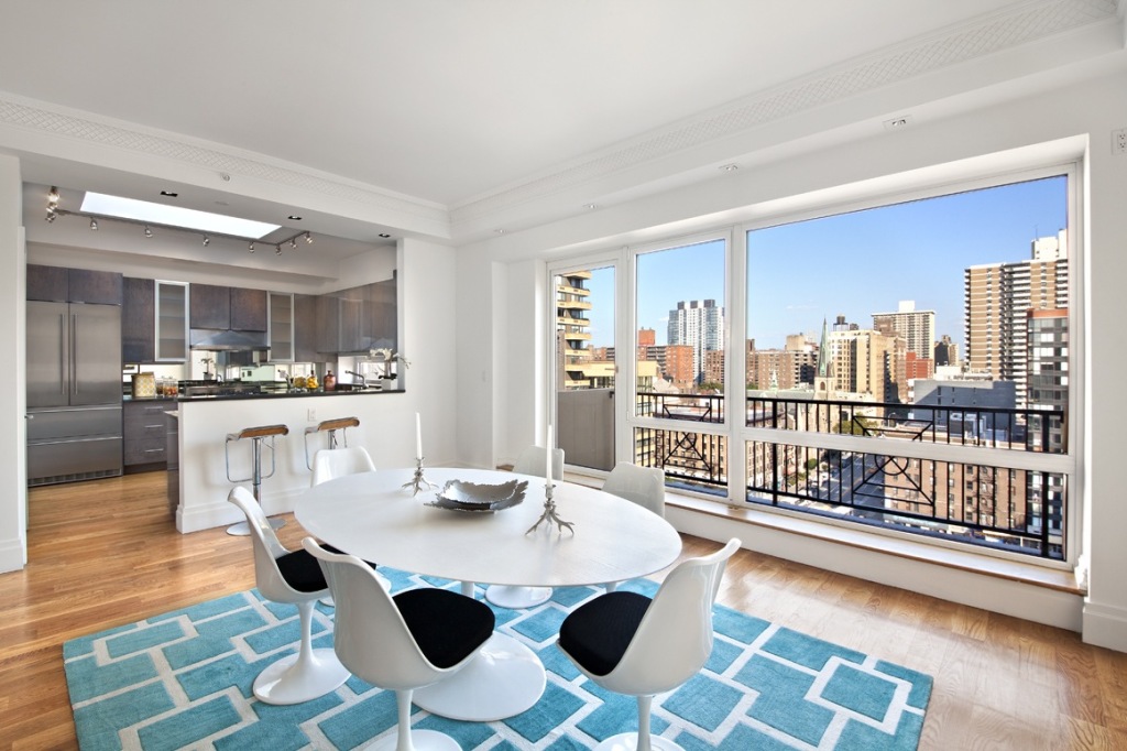
Adding a cheerful turquoise rug to anchor the oversized dining room, we brought the river view to the other side of the apartment.  That Hudson River view is a feature we want the buyers to remember as they flow through the unit.

Lots of sky in this staged penthouse on NYC's upper west side


The blue and orange color combination is visible outside as well as inside the Penthouse, like the bricks in the surrounding buildings juxtaposed against the sky.  This color combination has several advantages:

  1.  It is modern and bold but also cheerful
  2. The colors are recognized by many as the most eye-catching colors for online purposes and will draw in the buyers who are clicking around for inspiration and prospective homes.
  3. [According to Basic Color Theory] Being opposites, and therefore complementary on the color wheel, blue and orange imply maximum stability – an imperative in New York City Real Estate investing (especially when the list price is upward of $7 million). The color combination creates harmony, perhaps because the colors are related.
  4. This palette also suggests that a design professional has been employed, a very useful tool for staging high-end homes. The indication that the services of a professional interior decorator or designer were utilized increases the aspirational appeal of the property.  Buyers not only get to enjoy the design suggestions the Penthouse offers; they understand that this is the lifestyle they will enjoy when residing in this floor-through Penthouse with sweeping Hudson River views.

This staged penthouse has been just released and is getting great feedback.

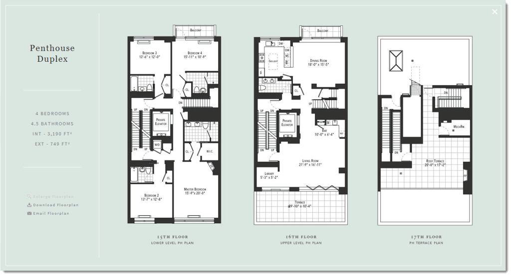
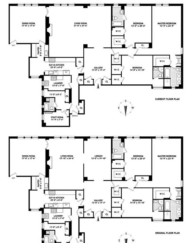
To have your penthouse staged by Amazing Space NYC, please call 917-428-3965, and ask for Debbie.  To drool more, here is the floorplan –>

home staging Upper Westside penthouse


Home Staging A Starter Greenwich Village 1BR

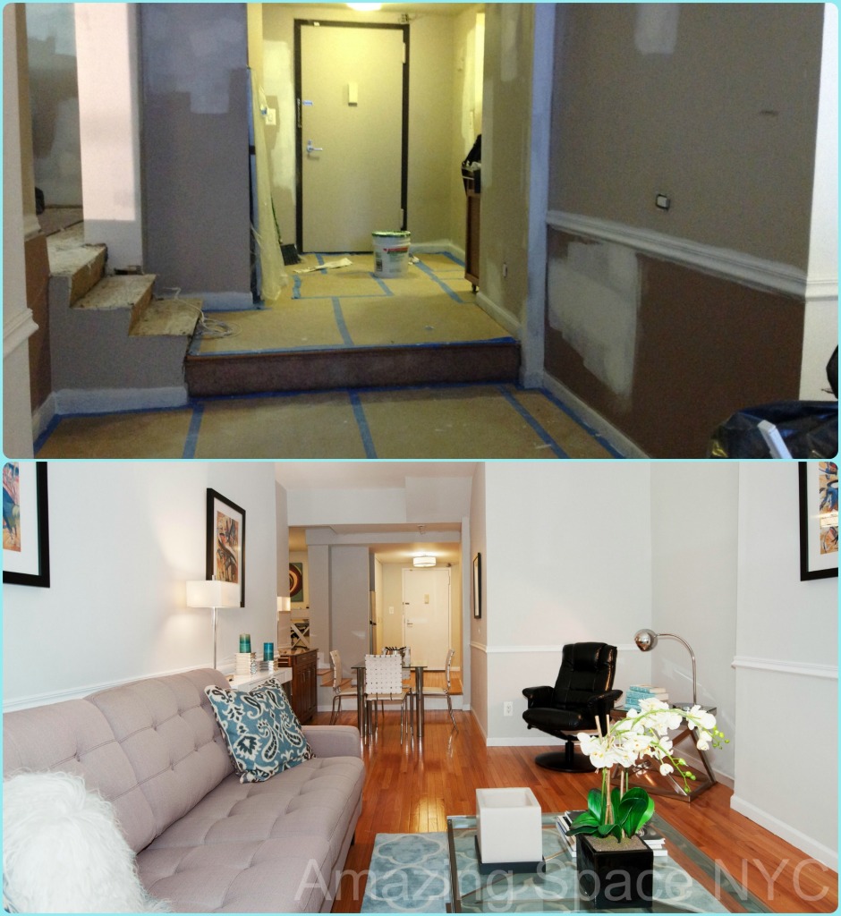
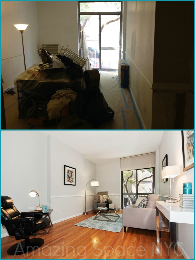
home staging greenwich villageLocated on the “mezzanine” level of a post-war building in the heart of Greenwich Village, this “starter” apartment needed a jump start.  We repainted the walls in a pale blue-gray with white moldings and trim.  New light fixtures were installed to provide a generous amount of light in the rooms.  A furniture plan that blended with the walls and trim creates a soothing oasis.

repainting is a home staging nyc tactic

When home staging a starter home,  our goal is to demonstrate that here is where true “living” can begin. You own it so the walls don’t have to be white.  You can buy real furniture. You can even buy fun, funky touches like the shaggy, sheep pillow.  We want to inject fun, lively and playful touches as well as providing that sense of zen calm that you are finally home. We make every inch of the 863 square feet count – with a dining area and a office just inside the bedroom.

home staging greenwich village

This painting is actually a 30″ x 30″ square… so you see the space is really quite generous here.

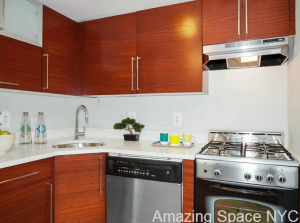
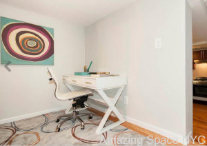
The bedroom is large enough for a king size bed.  With this much space, it is always good to be able to tuck a desk into a quiet corner.  By adding functionally defined nooks we create the sense of walking from “room to room”. We put two large wenge armoires in the space for additional clothing storage.  It looks fabulous!  The Juliet balcony at the end of the Living Room adds an air of sophistication, amplified by the chunky chair rail molding.  The kitchen, with stainless steel appliances and sleek contemporary cabinets, blends the best of old and new, character and technology. By keeping our color palette connected throughout the unit, we create a harmonious flow.

NYC home staging


A reading chair, in comfy black leather, is a tempting spot in which to curl up with a book.  The broker thought the finished look was pretty “amazing. That’s what we like to hear! 🙂

To have your starter home look like an Amazing Space,
please call 917-428-3965 and ask for Debbie.
PS — here’s the official write up as follows:

This spacious (863 SF), fully renovated one bedroom apartment is situated on the second floor of a full service condominium. It is ideally located in the heart of Greenwich Village overlooking tree lined Thompson Street. The apartment offers an open kitchen with stainless steel appliances, a Juliet balcony off of the living room, home office, king – sized bedroom, high ceilings, and beautiful floors throughout. This sophisticated and well proportioned home is full of character and a true gem. The Condominium has a 24- hour doorman and laundry on every floor. This friendly building allows pets, subletting and Pied-A-Terres. It is located near several subway lines, and is just a short distance from NYU, exciting night life, great local shops and restaurants. Experience the vibe of Greenwich Village.


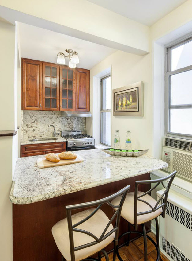
Home Staging NYC Kitchens Take A Light Touch

Kitchen - AFTER

1. Throw down some style!

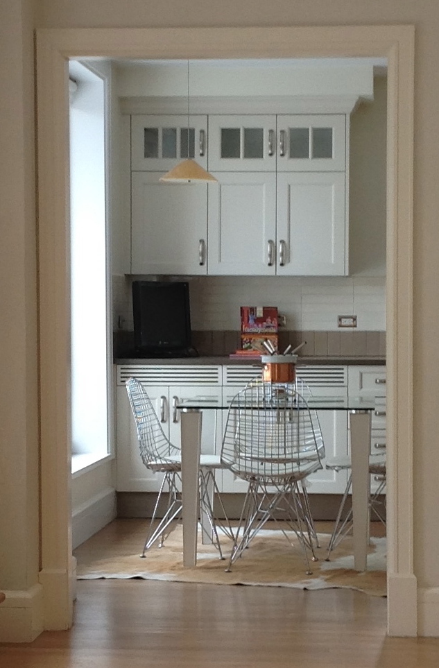
NYC kitchens tend to be small. How much actual cooking gets done is hard to imagine, though many New Yorkers proudly proclaim they can create multiple course dinners in theirs: “it’s all in the timing”. So as home stagers, when preparing a NYC apartment for sale, we need to be able to suggest cooking could happen in the space. some place to eat whatever’s been created?  Well, that calls for even more creativity!  Here are a couple things I keep in mind when home staging nyc kitchens – with examples from a few of my favorite recent successes.

1. One Big Bold Design Statement

Add style in the form of a design element – just one – whether it’s a striking piece of art, or a hide rug, or a state of the art coffee pot… even a retro fondue pot – and you will find the space packs a punch beyond its size.

NYC home Staging a kitchen

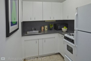
2.  Deep Clean – grime and gunk has to be removed, and grout given a good bleaching.

2. “White Glove Clean”

Seriously, clean even if you need to re-grout as a result…because with less accessories to look at, the buyer stares into the corners. It is worth hiring a pro for this, unless you’re newly single and vigorous scrubbing would be therapy.

NYC home staging

3. Find Seating – somewhere close

3.  Seating

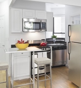
Even if there’s only a counter  or even a shelf, add a few stools and now buyer’s can see a separate space for a chai latte. The reality is that space will become where everyone uses their laptop, pays bills, and wraps presents, but in a small space, the horizontal spaces are a premium.

NYC Home Staging

4. Dress the kitchen sparingly, but with useful things

4. Dress Barely, One Flimsy Layer More Than Naked

Nothing on the counter is too barren, and as we’ve discussed earlier, it gives buyers nothing to look at beyond the grout lines and corners. A coffee pot, if gleaming, is fine as is shiny toaster. 3 trendy cookbooks in a row, if in mint condition is eye-catching, but one open is fine, too. A bowl of glossy red apples is an easy play, though it might suggest Fall to local buyers. Those red apples are grown upstate in lovely rambling orchards. Lemons, limes adn grapefruits last a little longer, and as they age, they can do you a great turn by cleaning out the insinkerator while aromating the room pleasantly.

NYC Home Staging with red accents in a kitchen

5. Accessorize the stove with a punch of color.

5. Put a pot on the stove.

Otherwise, its an awful lot of black! Just make sure the pot or kettle is in mint condition; a beaten up old favorite only sells “country”!

For advice on staging your kitchen when you go to sell your apartment, do reach out to me – my team is available for staging consults by appointment. The wait’s not too long!! :p 917-428-3965

Do Home Stagers Look At Trends?

Moroccan Trends

Ask successful Home Stagers if they follow the interior design industry trends and most will tell you “no”, that they maintain a timeless, season-less look.  A trend has to get pretty mainstream before most home stagers will consider incorporating it into their projects.  Amazing Space NYC has a different point of view on trends.  We believe that at certain price points, an interior that has elements of current design styles, colors and motifs can be essential to that property selling at or above the ask price.  New Yorkers want interiors that are current but workable within what often can be tight living quarters.  Here is what you might see in some of our future staging designs:

The 3 M’s: Moorish, Moroccan, Mediterranean

I thoroughly enjoy scouring the trade shows.  At last month’s NY NOW show (formerly known as the NY Gift Show), it was clear which patterns and styles were going to be the sweeping trend this fall.  Moroccan and Arabesque designs are not new to the interior design trend circle; I have actually written about them in the past, and they certainly are not fading away yet.   Designs that are attributed to southern Spain, northern Africa and the Arabian peninsula were a-plenty at the August trade show. Octagons, quatre-foil, kilim, ikat, suzani and Moroccan tile – these cultural icons will be the must-haves in design.  Take a few minutes to watch “The Making of the Palace” for the FX series “Tyrant”.  Cece De Stefano is a brillant designer and successfully encapsulated the grandeur and recognizable motifs of Middle Eastern, Moroccan and Mediterranean design.  ASNYC will embrace them in some of our future stagings as well.   [great video of the whole set construction process –> http://www2.fxnetworks.com/video/317595715663 – they built a whole palace]

Tyrant Set Design

Turkish Floor Lamp with mosaic and bronze

Turkish Floor Lamp with mosaic and bronze

Metals Move To The Warmer Side

Move over stainless steel and brushed nickel.  Polished chrome might fall to the back of the line, too.  The interior design industry is turning to warmer metals such as brass, copper and bronze.  But don’t worry – this is not the blinding, 80’s polished brass that we still have nightmares about.  The trend forecast is for brushed and matte finishes.  And while polished brass is finding a home in hardware, tables and light fixtures, the metal is not as yellow and loud as in previous decades.  The sheen is warmer and more sophisticated.  Go ahead and embrace this brass.  It reads elegance!

Other Popular Trends

Home Staging with Acrylic Furniture

Decoist makes a great case for Acrylic Furniture

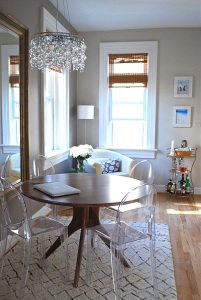
For a home stager in NYC, Lucite and acrylic are invaluable materials for Staging.  Physically, clear lucite chairs provide the necessary seating for a dining area without visually overpowering the area.  This is especially important when staging the infamous living-dining area combinations of post-war construction that continues to saturate the NYC real estate market.  A space with 4 to 6 clear acrylic chairs can look open and inviting; fill the same space with upholstered seating and the area just became claustrophobic.

Metallics are still a fave of the design industry.  You will see them on pillows and even rugs, any why not?  They add a playful bit of glint and sparkle to an interior without looking like the Pottery Barn catalogue at Christmas time.  We have metallic rugs and pillows – and yes, even a few sequent accent pillows – in our inventory and they get a lot of action.

Metallic Pillows

Enjoy the trends that are coming to this fall’s interior designs.  You will certainly see some of the motifs in the home stagings by Amazing Space NYC.

—————————————

For more about Amazing Space NYC’s interior design and home staging services, please call 917-428-3965.

Home Staging A Greenwich Village 2 BR

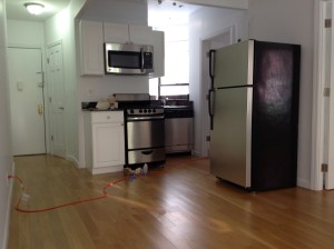
Beofre Amazing Space NYC has had time to work its magic.Before we started home staging a Greenwich Village 2 BR unit we went to see it and get the lay of the land, so to speak.  This 2 bedroom on the second floor of a quaint walk-up building left buyers scratching their heads. Immediately welcomed by a massive refrigerator ion the middle of their living room, the living space looked teeny and boring, not at all what a hipster who wants to live in the heart of the Village wants to see when they open the front door.

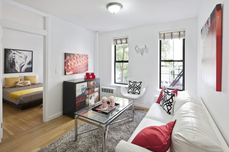
We got to work.  We transformed the place by adding color and furniture tailored to the space and the target demographic. By adding a small bar height table and stools we successfully created a dining area that takes some of the attention away from the refrigerator’s location.

You might think that we chose red as our accent punch because Fall is on its way and our instincts turn to seasonally warmer colors. In actuality, my inspiration was this fabulous chest which would be considered a Must Have by any generation, and the likely demographic for this unit.

The 2 bedrooom, 1 bath apartment, what used to be called a 4, is listed by Jeffrey Wachtenhiem, with Town Real Estate.

Amazing Space NYC adds pops of red to glamorized an expensive 4 room walk up

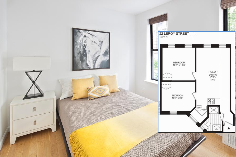
Both bedrooms lack a closet, a fundamental flaw in the room designs. By placing a dresser in each room, in the location where a closet or a large wardrobe unit could easily be placed, we allow potential buyers to see that this situation can easily be overcome. We staged the second bedroom to be a den/guest room using a futon bed and colorful art and pillows to jazz it up.

amazing Space NYC works wonders home staging the master bedroom

As you can see, we are not dealing with large rooms; yet it feels chic and fun.

Asking $965,000. Here is the broker’s description:

Incredibly charming and perfectly located, this two bedroom home is situated on Prime Leroy Street in the heart of Greenwich Village / West Village neighborhood. A RARE offering, this sponsor unit requires no board approval and is ready to be moved into. This home features a renovated windowed kitchen, windowed bath and the perfect Village location. Just one flight up in a charming, prewar walkup building with beautiful iron work, this is one not to be missed.   Just steps from at least 50 bars and restaurants, multiple train lines and incredible eateries such as- Murray;s cheese, Faiiaccos, Joe’s Pizza and so much more. 

  __________________________

For more information on staging your NYC home for sale,

please call 917-428-3965 and ask for Debbie.


[Home Staging NYC] Brooklyn Dodger – Now Beauty

NYC Home Staging

This one bedroom ground floor apartment in the heart of Brooklyn Heights looked worn out and forgotten. Until Amazing Space NYC took over and turned tired into tasteful and worn into wonderful. The living room was repainted in Natural Wicker (OC-1) with Chantilly Lace white trim, setting the back drop for warm furnishings that complement the dentil moldings and darker wood tones in the kitchen cabinetry. The green was removed from the bedroom walls and ceiling and replaced with a white ceiling and Linen White walls. But green was not forgotten; our design team used it as the accent color to highlight the trees and leaves that are framed by both the living room and bedroom windows. A few accents to make the place appeal to the first time home buyer and this one bedroom is ready for its first open house.

NYC Home Staging

Happy Selling!

Link to listing — http://www.elliman.com/new-york-city/30-monroe-place-1f-brooklyn-vcggmcl

NYC home staging

2014 Trends – from this NYC Home Stager

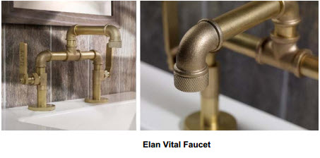
Yes, it’s back! Un-lacquered brass (some vendors are calling it “satin brass”, “antique brass” and somewhat obviously, non-lacquered brass) is  considered to be a solid contender for the people who are “been, done that” about nickel and chrome. The theory is that brass is warmer and more elegant than its silver metal counterparts. It advances the appeal of the industrial decor revolution because  there’s little to no shine. And based on usage, each piece will tarnish and “age” differently.

“Everybody wants it!” reports Lauren Henry of Davis and Warshow a wholesale plumbing supply supplier to designers, architects, homeowners in New York City since 1925. “It’s been crazy; everybody for the last couple of months, maybe a year even. And they’re using it everywhere for everything – faucets, full bathrooms, kitchens, everything!”

Why?

“They like the way it tarnishes. Well, they like the idea of how it will tarnish. Most don’t seem to like the way it really does,” Lauren chuckled.

In this contemporary bathroom above,  the style comes from clever sleek combinations.  The matte black is a silestone surface called Tao in suede finish.  The oval mosaic sink is wide enough for a couple to share and beautifully echoes the oval tub. A sumptuous brass rain head in the shower satisfies the most lascivious aesthete; the views? Well, if I had to guess I’d say this photo was taken in NYC looking out at onto the West 70s somewhere.

Where are you with brass?

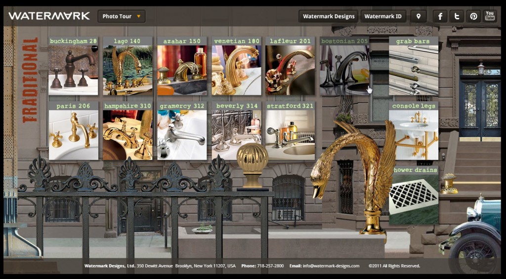
Suppliers like Samuel Heath and Barber Wilson are all jumping on the trend.  Here is just the traditional suite from Watermark, the Brooklyn manufacturer that Manhattanites yearn for —

home staging NYC trends with interior design
Can you believe that swan, in your grandmother’s house in Florida, could possibly become the biggest trend… again!!

2014 trends in NYC home staging

For interior design and home staging, please call Amazing Space NYC lead designer, Debbie Oulvey at 917-428-3965.