A Vacant Home Staging in Morningside Park

Vacant Home Staging is the best strategic play when marketing today’s NYC homes for sale.  Buyers find empty rooms confusing. Let’s face it: few people can correctly guess the number of jelly beans in a jar, much less figure out how to fit a living room set along with a dining area that seats 4 to 6 people into a space that poses a sizeable column as you enter the room and two huge PTAC units jutting out from under the windows.  Buyers see awkward shapes in rooms that feel barren.  There’s nothing to connect to, no warmth, just rooms that feel SMALL.

Unappealing vacant home staged by Debbie Oulvey

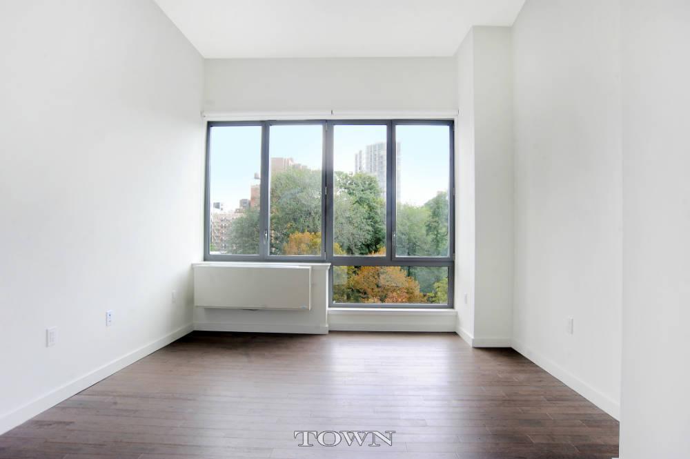
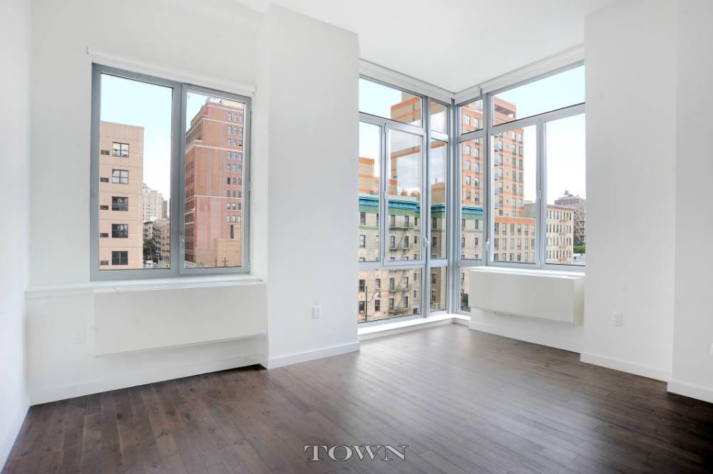
Here is what we saw when the rooms were vacant:  pleasant views, good light and height, new wood floors, the angles are…. wow, those AC units are huge! This two bedroom in Morningside Park presented plenty of upside, but it was impossible to focus on the plusses when the minuses were staring you in the face.

home staging NYC

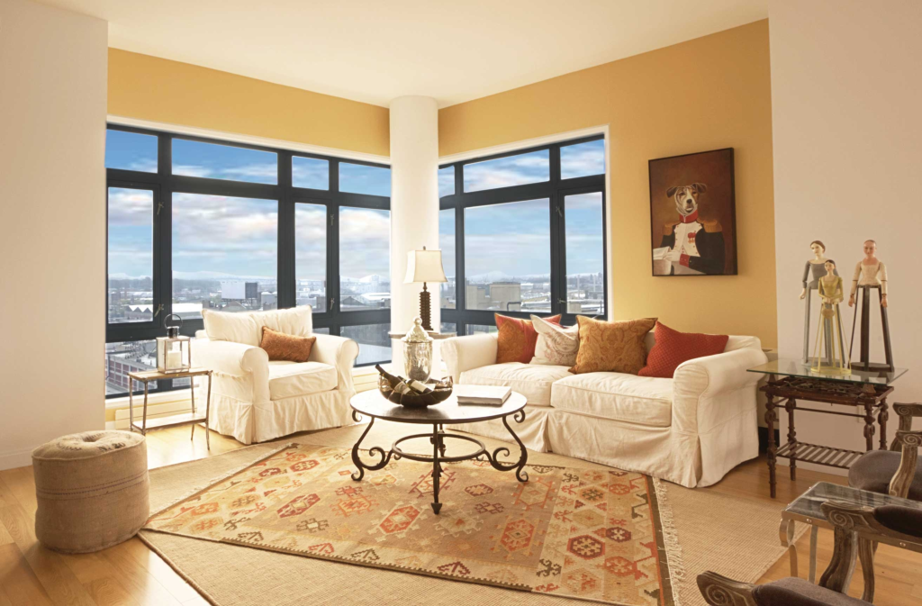
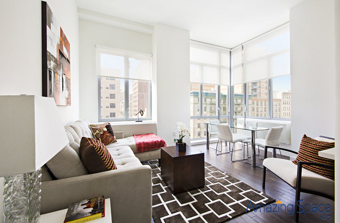
After vacant home staging – look how big the room looks with furniture in it.   The glass dining table makes POW-erful statement!  The corner, floor length windows are emphasized, stylishly and there is a ton of seating in this room: 10 easily!  And now, you don’t even notice the radiators

MBR Before

Really, this room could be anything. Buyers were wondering how to place the bed and would there be room to actually get out of bed without knocking into the PTAC unit.

Vacant Home Staging in Morningside Park

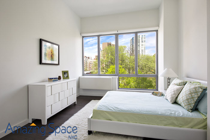
Yes, there’s plenty of room! We took the modular feel and kicked it up into a chic design. The modular looking chest of drawers and the sleek bed give us a design motif that is completely congruent with the space. We brought the outside in with our linens and artwork – a subtle way of reinforcing the views.

2nd bedroom

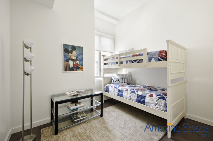
The original listing did not even have a photo of the second bedroom because it looked too small. Now, thanks to the staging, it shows a bedroom for 2 children, exactly what this area is attracting . . . young, growing families!

A room that was too tiny for even one child becomes a great place to play, [sleep, live, etc] for two. Is there anything more American that boasts family-values than Mickey Mouse and red, white and blue? There is a connection that will happen here.

The square footage of this apartment might not be overly abundant, but there is plenty of space for lots of living.  This is vacant home staging at its best – moving the target buyer to emotionally connect with the space and see themselves happily growing in the home.


Long Island City – A Look Inside Just One Of Many Renovated Buildings

Home Staging in Long Island City

Flickr – c/o daydaygonzalez

Long Island City was “put on the map” in 1990 when Citibank built One Court Square. Fifty stories of green glass with 27 elevators, this structure was the lone ranger, towering above the warehouses and 2-story buildings that comprised its skyline.  No matter what your status on the Citi corporate ladder, you relied on the 7 train to get you to the glass tower.  It took 12 minutes from 42nd St. to One Court Square.  After your meeting, you jumped right back on the 7 to Manhattan.  There really was nothing else to do or see while in this section of Queens, despite its close proximity to the Big Apple.

Long Island City was one of the first areas outside of Manhattan to develop. The “evolving Queens, New York, neighborhood seems to change from block to block—a short walk takes you from desolate, early-20th-century industrial streetscapes to the gentrified “main street” vibe of Vernon Avenue and the urban riviera created by gleaming high-rises fronting waterside Gantry Plaza State Park.”  [TimeOut’s introduction to their neighborhood guide of some great bars, brunch places, restaurants and local hole-in-the-wall stores with surprising finds.]

BHome Staging by Debbie Oulveyut perhaps you really know that a neighborhood has moved up the residential status ladder when a high-end, Manhattan lifestyle stager is called upon to create a fun, urban and sophisticated lifestyle, one that, in former years, might have only been considered for a townhouse in Brooklyn Heights or the Village.

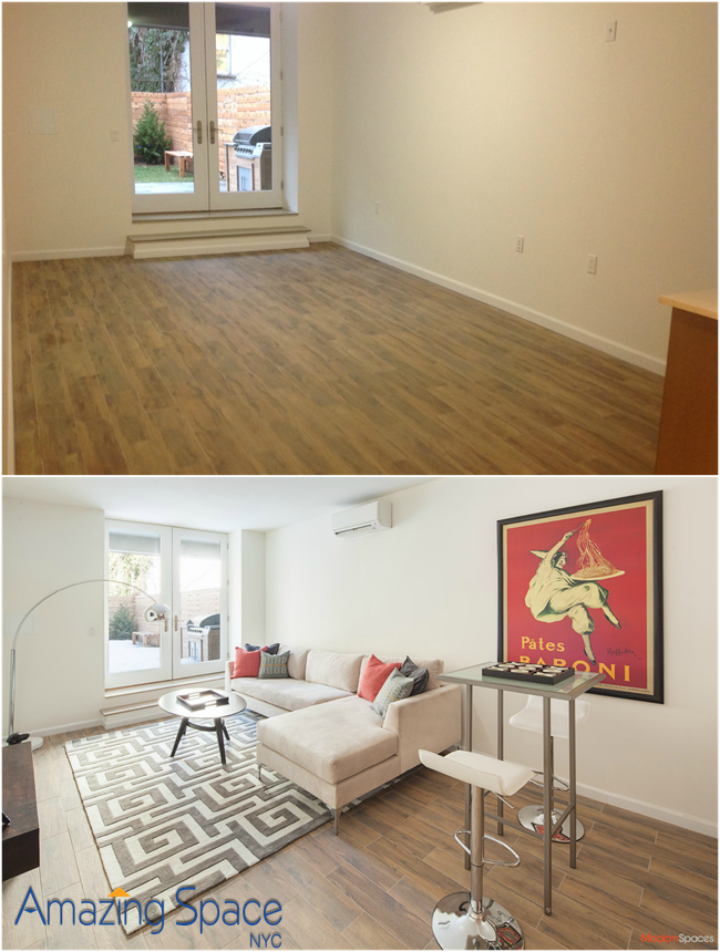
Long Island city Duplex with staging

Main Level
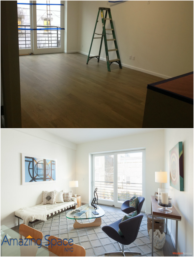
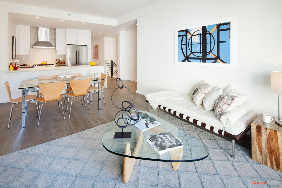
Main floor living -dining space. Left empty, even the most sophisticated, experienced buyer would be challenged to see the possibility of entertaining and dining in this room.

Long Island City Duplex is staged for sale

Staging in Long Island City


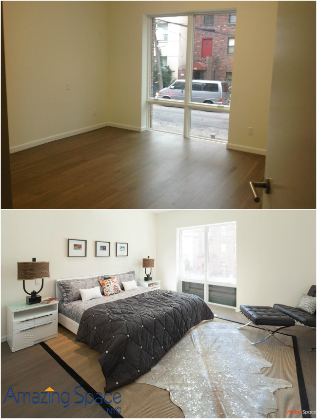
The Master Bedroom is huge and can easily accommodate a king bed, a lounge chair and a dresser. But all the buyers focus on is the window that overlooks the street.

Debbie Oulvey Staged this Master Bedroom

The Lower Level
We transformed this room that leads to the yard into an inviting, comfortable and fun TV-Family room. While parents entertain upstairs, the kids can come down to watch movies, play games and be loud!

Staged duplex in Long Island City

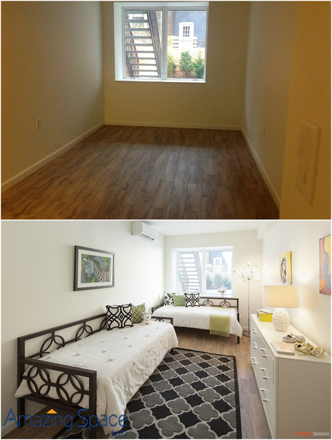
In this next photograph picture is a narrow bedroom with a nice walk-in closet. We added 2 daybeds, a dresser, pops of black and green and lifestyle accessories, turning it into the bedroom of an aspiring artist and thespian! One of Long Island City most well-known venues is a theater called The Chocolate Factory.

children's room staged


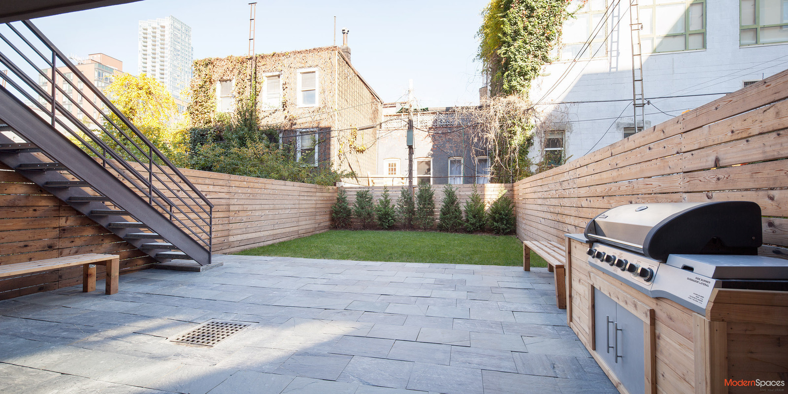
It’s not every urban oasis that has a lawn to mow!

Backyard

And lest you think Long Island City hasn’t hit the big time yet, this home is listed at $2,350,000.  That’s getting closer than 12 minutes to Manhattan pricing!

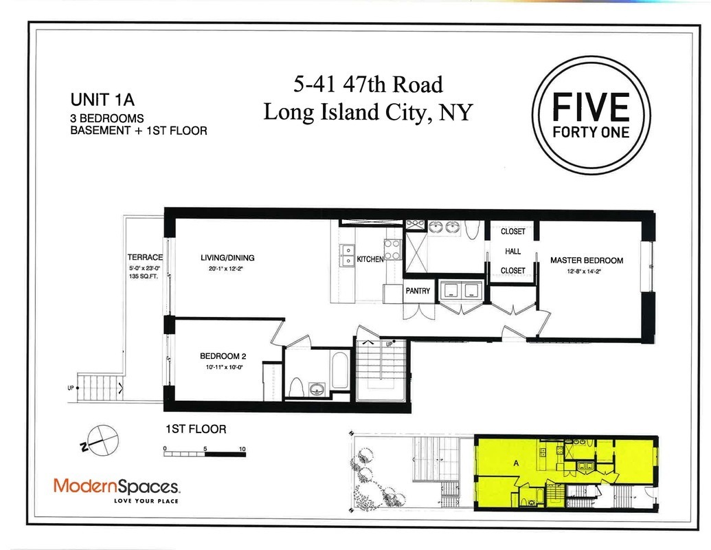
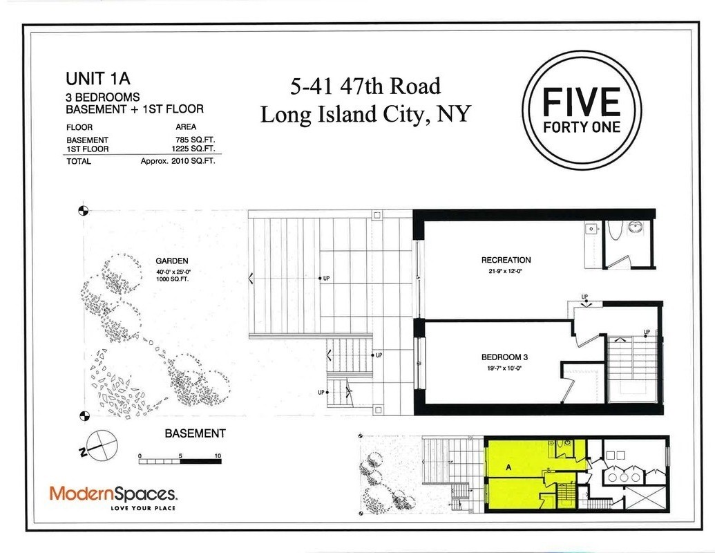
Floorplan


Stagers Should Attend the Photo Shoot. Even Experts Need Another Eye!

stagers photo styling

Fred Astaire “helps” Richard Avedon

Recently, I read an article about Staging and Photo Styling that contained some very useful tips for preparing a room for professional marketing pictures.  Real estate experts and professional stagers agree that the first impression is often the last impression so the marketing photographs need to be eye-catching and show the property at its pinnacle.

THE DILEMNA

Should a Stager design and install a staging plan based on the angles from which the photographs will be taken or on the buyer walk-throughs?   Or is there a way to provide the best of both to a seller?

THE ANSWER

The answer is yes, and very simple.  Hire your stager to be on-site for the photo shoot.  Working directly with the professional photographer and seeing the room through the camera’s lens, we often rearrange not just accessories, but rugs, lights and the furniture in order to create dramatic and appealing photographs that will be posted on the various websites and included in tear sheets.  Maybe a rare photographer would see it as interference, but given the importance of online images as the start point for buyers, stagers should attend the photo shoot.

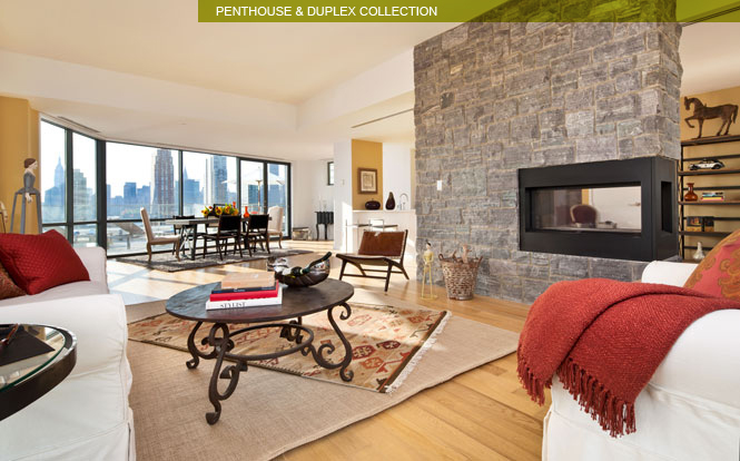
In a Penthouse Unit in Long Island City, the cocktail table, side table, accent chairs, sofa, rugs and accessories were all rearranged for that “wow” picture.  After we relocated the furnishings to just a few feet from the wall of windows (which was the location of the camera for this fabulous shot of the entertaining space), we rearranged every pillow, book and accessory – even in the den on the opposite side of the fireplace – in order to maximize the impact of the photograph.   Two accent chairs and table were removed from the seating arrangement in order to open the view into the dining area and out to the terrace.

Long Island City Home Staging for photos

When the listing brokers brought buyers into this penthouse, this was the furniture plan that greeted them.  Look closely at the coffee table and the sisal rug with the kilim overlay.  You can see how much we rearranging we did for this shot (along with chair substitutions along with a prop and accessory shuffle).

long Island City home staging of a penthouse apt

As another example, this is what happens when I’m not there -below- look at the rug! It’s a simple detail that’s been overlooked; the camera preview square is small, I get it. Yet this simply would not have happened had the stager been onsite. Just have us there, even you can’t bear the interference of a photo stylist!

Stage the Shoot for meticulous photos

It truly is worth the one or two hour investment to have your Stager on site for the photo shoot. You have one chance to make that first impression and to capture and present the money shot.


Photos courtesy of Evan Joseph.

Color Splash

Color Trends Sherwin WilliamsI get excited when the color trends are released.  Almost instantly, I start putting together color palettes for room design projects that I don’t even have! Although I lean towards Benjamin Moore for my projects, I turn to Sherman Williams for paint color trends and forecasts.

Here are the 4 SW color trend 2014 categories and a synopsis of their descriptions:

2014 Color TrendsReasoned:

Browse through any design magazine or log onto Houzz and you will instantly see this Color Trend which is continuing through 2014: Gray is the new Black. A few years back, it was Brown but Gray has planted roots and continues for yet another year to be a foundation, a color staple in room designs.  Gray will continue to be associated with math. Think maps, compasses, astrology.    In other words, Restoration Hardware will still be a consumer’s go-to for design inspirations.  Fortunately,  I have been using a lot of gray in 2013 so my design inspirations will still be “in” next year!   Some of my favorite grays are by Benjamin Moore, such as Edgecomb Gray and Revere Pewter.

2014 Color TrendsDiaphanous:

Sherman Williams refers to this category as light, delicate and translucent. This is your “safe” palette, perfect for home staging and for clients who just cannot quite commit to a saturated hue.  I must admit, I am intrigued by a few of the SW colors in this collection, such as Fleur de Sol and Steamed Milk.  You might be seeing them in future Amazing Space NYC staging projects.

2014 Color TrendsIntrinsic:

This collection is a melting pot of cultural experiences and crafts.  You can hear the calypso drums and reggae rhythms, tribal drums and bustling street markets.  The collection invokes an ocean breeze,  the Serengeti,  rolling hills and vast deserts.  The colors are saturated and vivid with a palette that is deeply rooted in tradition.  There are some gorgeous colors in this collection (the blues really captured me).  Home stagers, this is not the collection for you.  Designers, knock yourself out!  This collection can add intense beauty to the walls.  Picture an entire room of furnishings in white/off-white fabrics against a backdrop of one of these colors, coupled with pillows and accents that complement the culture and the hue on the walls.

2014 Color TrendsCuriosity:

The SW description says it best: “…where mad science meets fantasy, and sweet dreams overlap with feverish nightmares.”  There is a solemness to these brown-based colors, and while they are deeply saturated hues that will command attention,  a feeling of despair washes over me when I look at them.  I am sure this palette will find a home, but it probably won’t be in one that I design.  It freaks me out!

No matter what the trend or forecast indicates, I believe we should use color to match our mood, our passion, our vision.  But it is always fun to see what the color weathermen predict the trends will be.  Hopefully, the color forecasters are better than the weather ones!