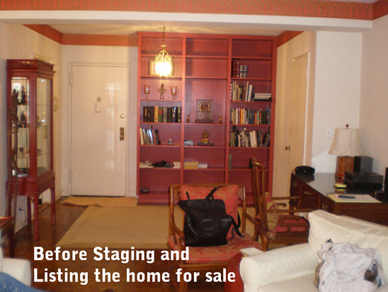
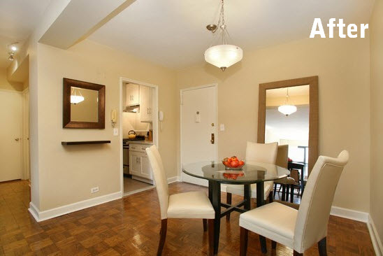
When Home Staging NYC Apartments, there are tough calls to make… like where will people eat?
While the apartment did show a dining pendant, it was not properly positioned in the room to accommodate seating – and there was no dining furniture either. The floor-to-ceiling red bookcase visually overpowered the area and took up valuable floor space. The dated pendant was hung too close to the front door.
The staging plan: we removed the built-in bookcase, the red wallpapered border area and all of the tired, style-specific furnishings. We had the walls skim coated then painted in a neutral color . We added a more contemporary light fixture that was swagged to hang over the newly created dining area. The floor mirror allows buyers to see the beautiful tree top view out of the windows at the other end of the apartment, even when they are in the dining area. The wall mounted shelf and mirror created an “entrance”, a place for Buyers to drop their keys and cell phone when coming home.
The result: an intimate dining vignette that not only welcomed buyers into the apartment but allowed them to see dining for 4.
After Thought
Sometimes the very things that make our homes have character and charm are the detractors when it’s time to sell. And this is why a seller can not prepare an apartment for sale on their own. They are too close it and can’t see the counter-intuitive measure that will be a lucrative decision in the end. Plus, for many New Yorkers, a built-in bookshelf would be a rich feature; but is an eating area for 4 more likely to bring in a higher price? It is well worth the investment of an initial consultation.

