Curbed And Flourishing in Brooklyn!

It’s always nice to see your own work in the press! These lovely models were featured an article on Curbed.  These models were in the process of being finished, I had yet to hang the artwork. Nonetheless, I think the photos make the units look real, spacious, stylish, and good fun. What do you all think? Apparently, they’re being snapped up really quickly.

This was a NYC home staging in Brooklyn, where a 1 BR can cost north of $700K!!  It was fun to focus on the mid-century modern designs here, as that is the taste of the target buyer.  The appliances and finishes are impressive; lustrous quartz, Viking cooktops and refrigerators – and in a “sponsor apartment”, no less!!  (Of course this is a builder, not a sponsor and those early co-op days of the oak-trimmed Formica cabinets are long behind us. Still, there are many who remember…)

There are rental units mixed in, and those units have GE appliances, but still textured gray cabinets and quartz counter-tops.  That and lovely 3″ gray wash oak floors.

<sigh>

I love home staging NYC!


__________________________________________

For more information on how you can have your own home staged for sale by Debbie Oulvey,
please call 917-428-3965

Staging Model Units Is a Unique NYC Home Staging Skill

NYC Home StagingOften times, New York developers hire a high-end (and über-expensive) designer for the more expensive units in a new development.   The rooms are over-the-top, dripping with everything that personifies the designer’s signature style.  Unfortunately, these showcases do not usually lead to sales as the prospective buyers cannot identify with the style or the use of the space.  It is just too specific (and usually appeals to a very small percentage of the buying clientele) but the installations make for great photo op’s and press coverage!

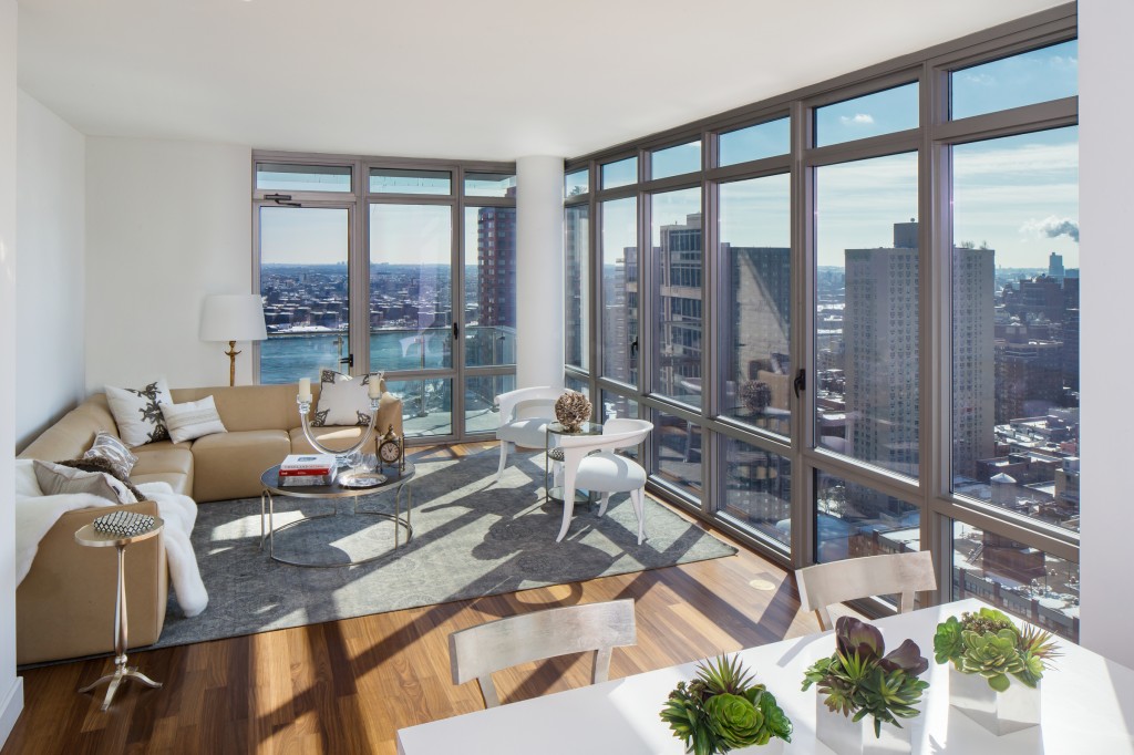
Such was the case with 2 Units in this upper eastside development.  While everyone enjoyed the opulence of the designer units, the marketing team wanted room photographs that were more about the views, the space and the use of the main living areas Our company was hired to build 2 new living spaces using pieces from the high-end designer units.  We cherry picked everything – from rugs to sofas to books for the coffee tables – and built rooms that reflected the price point of the Units without being so overly decorated that buyers would only remember the furniture but not the room itself.

The development and marketing teams both commented on how completely different the furniture looked when it was paired with different accessories.  I wanted to emphasize the spectacular views but also offer a comfortable counterpoint to all the glass and steel. A buttery cream sectional sofa placed on an elegant, neutral rug anchor the space.  A round coffee table, gold-leaf occasional table, open accent chairs and complementary accessories soften the overall impression as does the fabulously rich, white fur throw.  So as to not detract from the blue river and sky, we relied on beige, cream, whites and grays for our palette with pops of color in the green succulents and the one red coffee table book in the center of the living area. The neutral palette allows the sky, river and city to take center stage.  Looking at this room, I am reminded of a quote the Nobel-winning mystic Rabindranath Tagore —

“Clouds come floating into my life, no longer to carry rain or usher storm, but to add color to my sunset sky.”

Quiet appropriate, wouldn’t you say?