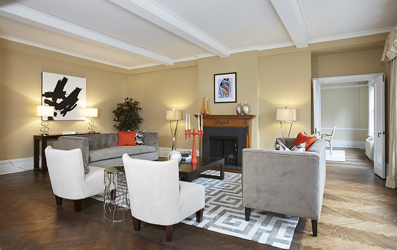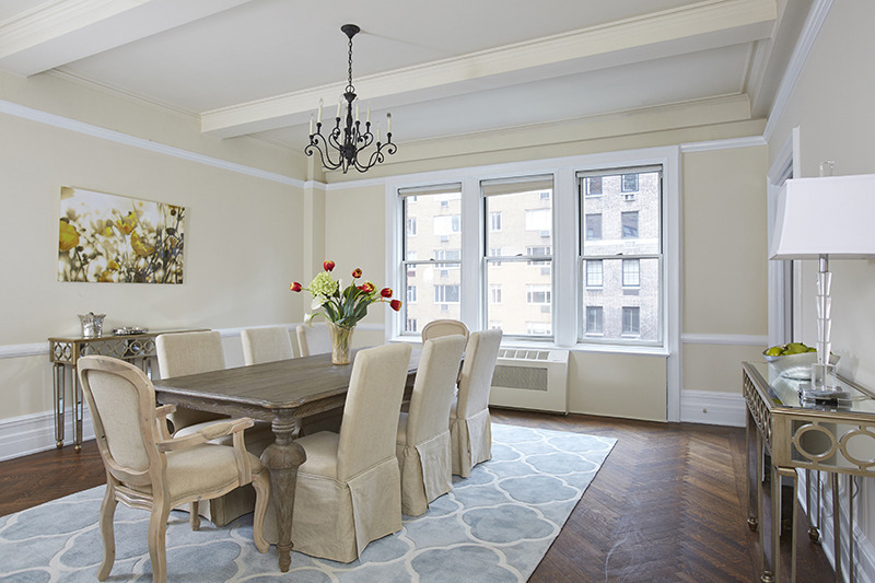
Possibly the best kept [owner occupied] pre-war secret in the NYC metro area!

Owner Occupied Home Staging NYC

Possibly the best kept pre-war secret in the NYC metro area…possibly even the country!

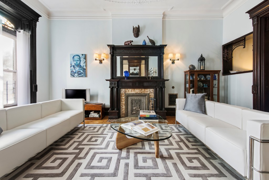
This glorious owner occupied townhouse in Crown Heights Brooklyn will come to market in 2 weeks.  Keep in mind, this home is owner occupied, so our staging had to be easy to maintain while allowing the spectacular architectural detail to shine.  Sun-bleached curtains were replaced with flowing white sheers to allow the stained glass windows to be a focal point.

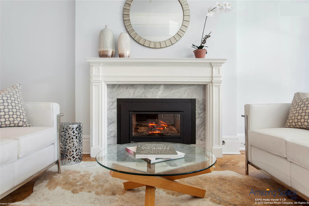
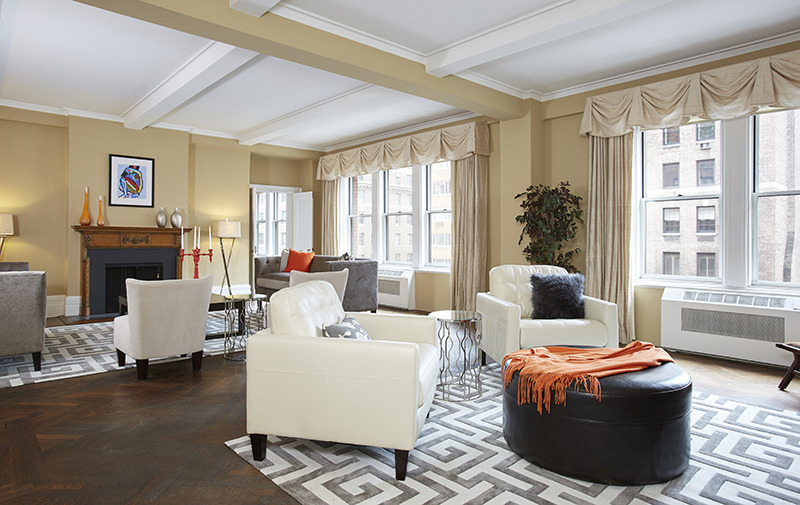
We removed the micro-suede, over-sized and worn-out sectional, replacing it with the sleek modern contemporary Corbusier white leather sofas and a Nogucci cocktail table.  The large rug anchors the space and all of the soft tones allow the main attraction to be the mahogany stained fireplace, woodwork and lattice trim.  We did an edit and rearrange of art and accents to create a room that is all about . . . . . THE ROOM!  Gorgeous!
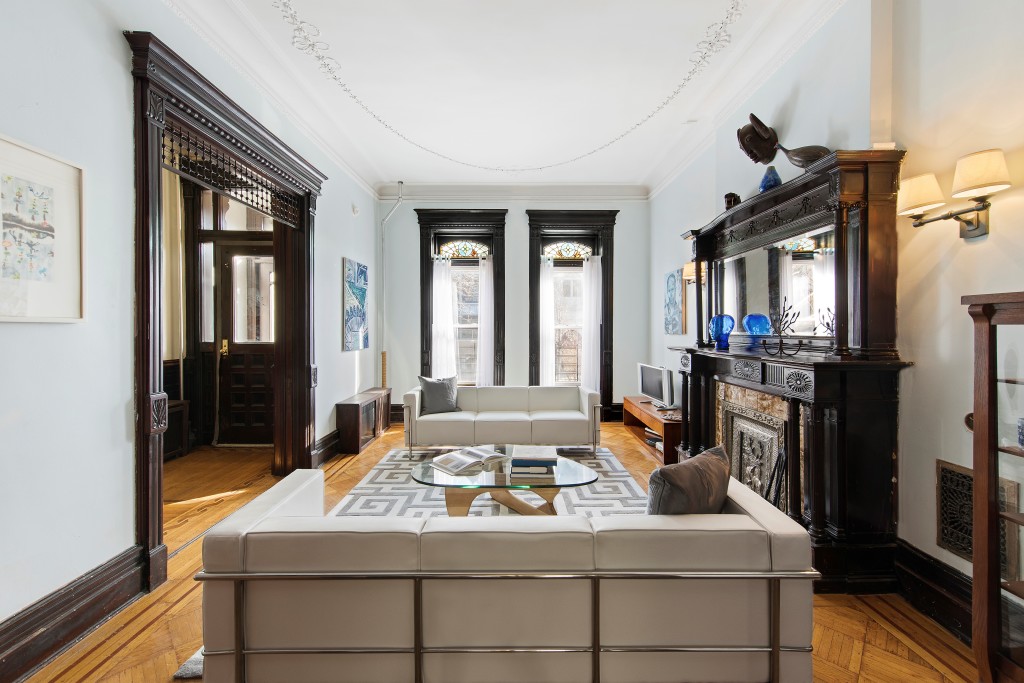
Owner Occupied pre war in Brooklyn

White sheers are the perfect dressing for the windows.  Now the windows are all about the beautiful dentil and fluted trim and inlays that surround the 2 windows facing the street …. and the stained glass!

Oh, by the way, check out the original  plaster work on the ceiling. Stunning!

_______________________________________

For ideas on how to stage your owner occupied NYC home for sale, please email me.

_______________________________________

Corbusier Sofas – From the man who said that “Chairs are architecture, sofas are bourgeois” how come his white leather sofas are so very NOT bourgeois but the height of chic and style? The pieces feel eternally modern, and have long come to epitomize “International Style”. They are hardly modern in reality, having been designed circa 1928 – 1930. Le Corbusier drew inspiration for his designs from the Fibonacci Sequence.  The pieces are thought to be sublimely comfortable.

“Authentic Classics never stop telling the future”.
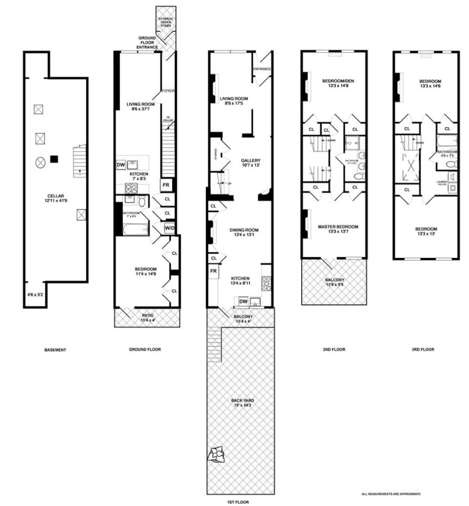
Home Staging a NYC 3 BR Rowhouse

home staging a nyc triplex135 Cambridge Place, Brooklyn

This Clinton Hill historic home was a renovation that maintained a lot of the original charm and character of the architect’s design. It is a two-family home with a 1 BR apartment below and a family triplex above.

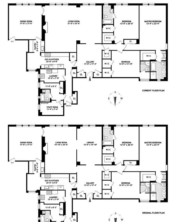
As you can see from the floorplan, the rooms are narrow.  Being only 15′ wide, the front sitting room is challenging (it is the room with the 2 white Corbusier love seats, fireplace with round mirror and skin rug) and the bedrooms all have small closets so we had to show storage in the form of dressers and chests in every room.

home staging a brooklyn living room

The developer wanted all of the furniture to be as true to the character of the period as possible but the broker wanted a more current decor to appeal to the 30-40 year old buying demographic. This front room was a back-and-forth as white leather was not what the client wanted, but when he saw his choice in the room, it was clear that light and low was the way to go. The front room is now a sitting/conversation area that feels intimate but not crowded. Home staging is often a compromise, and we had a really good result with this home.

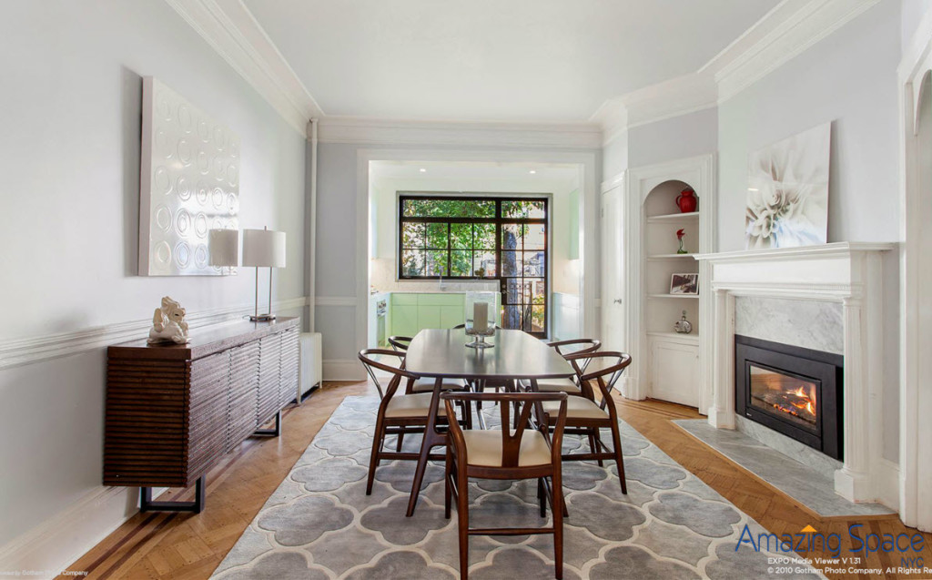
Midcentury modern dining room

The advantage to mid-century modern furniture is 1. it appeals to our target buyer, and, 2. by being lighter than many of the more traditional pieces, it takes up less space – physically and visually. Now you can focus on the fireplace and the extraordinary amount of natural light flooding through from the kitchen, not on whether you’ll bruise your hip on the giant table as you go to turn on the fireplace!

Family Room

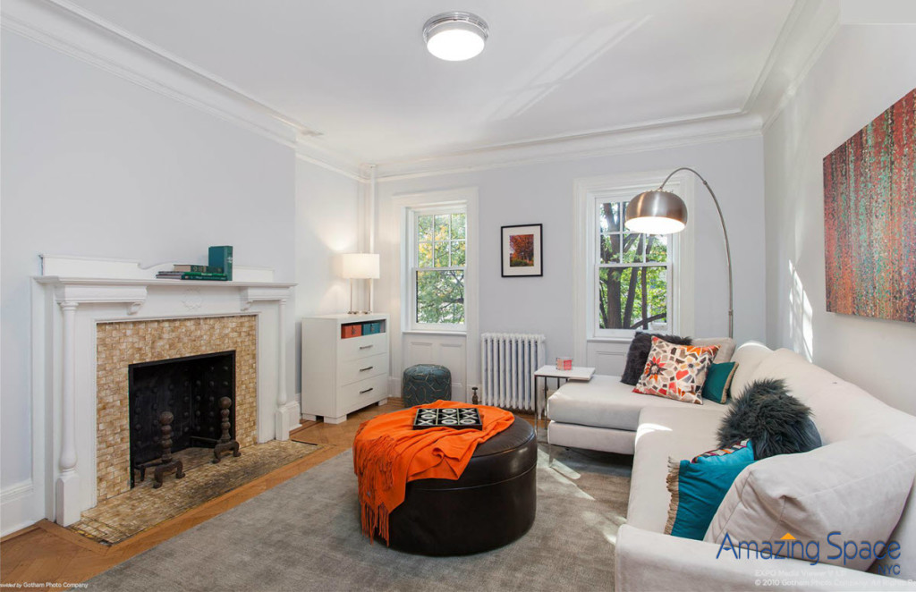
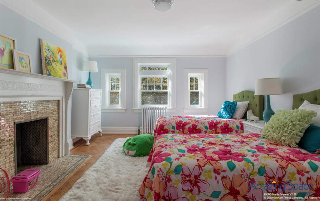
To accommodate the children, we created a family room for watching TV, lounging and gathering time on the second floor. We also took one of the 3 bedrooms and gave it a serious, k.i.d. vibe!

Kids BR

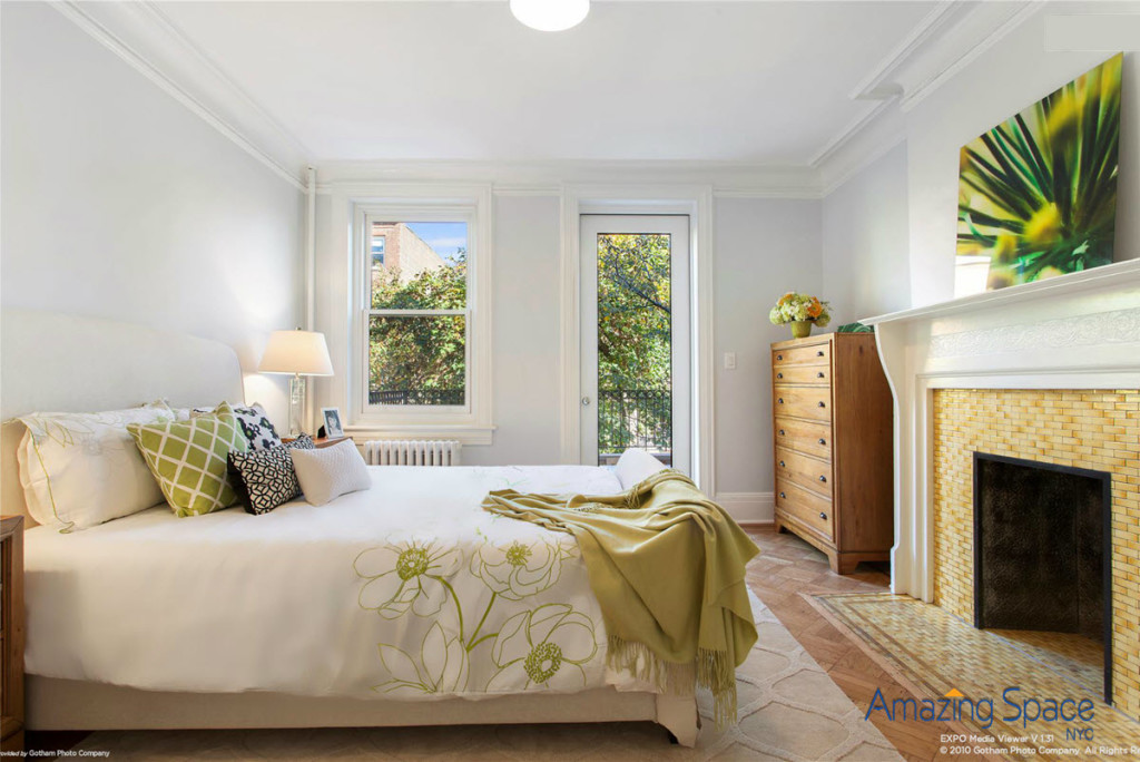
For the master bedroom, we combined the warm, gold tiled hearth with the trees outside to create a green, serene scene. Everything leads your eye outside to sky and trees. It is now a calming space but practical and romantic.

home staging with Amazing Space NYC

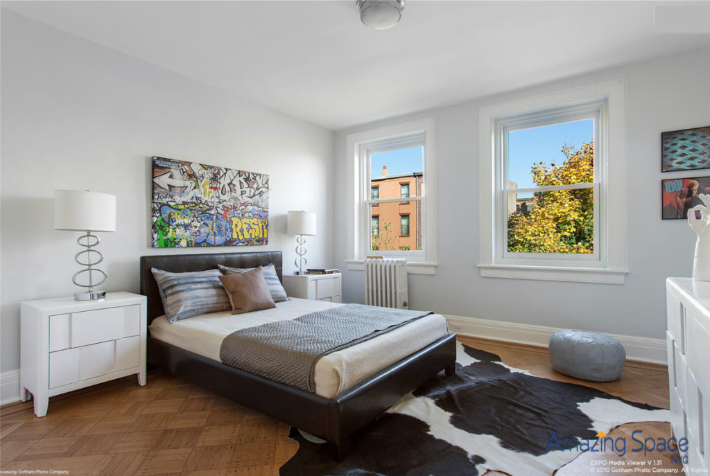
The second bedroom can be interpreted in a variety of ways –

home staging a second bedroom

whether for a teenager, a set of in-laws or perpetual guests, this room provides a stylish, on-trend welcome.  You might think we’ve run this skin thing into the ground, but these cowhides are gaining in popularity month by month!  We have used several here to connect this home to its chic, up and coming Clinton Hill location.  Currently one of the hottest neighborhoods, it has ample places to play – quality dining, shops, coffee shops, bars, transportation (2 short blocks from the house is the subway), The Barclays Center, BAM, Pratt Institute and downtown Manhattan.

Apartment Staging in NYC’s Upper East Side

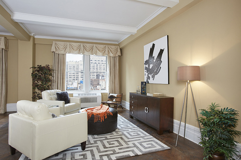
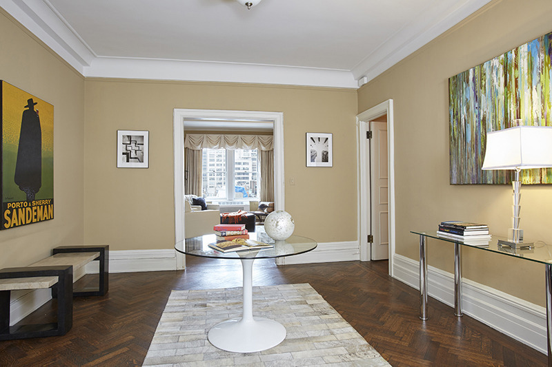
Apartment Staging is not so different from home staging, but there’s a knack to it.  Like so many of the successful home staging principles, the key is to try and match the style and layout to fit the needs of your target buying demographic.  I’m sharing this particular listing, though there have been many this season, because this apartment staging illustrated a tenet I hold close – When staging an occupied apartment, you do not always have to move everything out and start again.
Often the buyer of a property will be a version of the current owner and is attracted to the finishes and style that have been already implemented in the residence.  How the owner has made the apartment a home, if it has been any length of time at all, can often indicate a good use of space.  And, frankly, just as often not.  The key is in the compromise and elevation – to highest and best use!

Second Bedroom

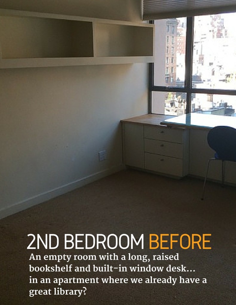
Before Apartment Staging of the second BR

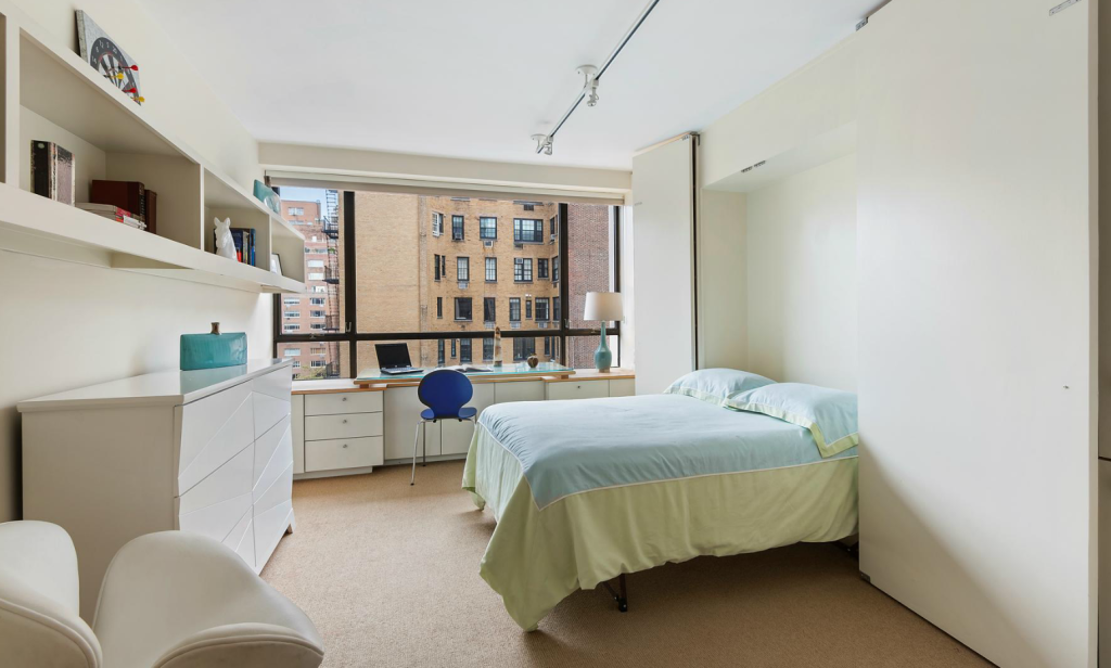
Apartment Staging of the Second BR
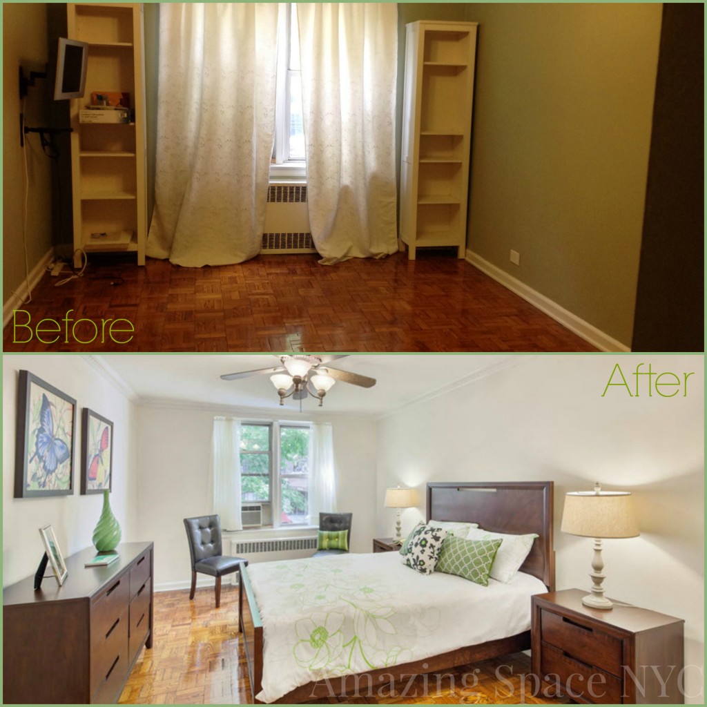
A murphy bed might not be the ideal choice for a second bedroom but we think we made it work. A fresh coat of paint, then organizing and accessorizing the shelves took us a long way.  We added bed linens, art, a dresser, lighting and an accent chair then layered the desk with suitable props to create a story.

By bringing in blues and greens, we transformed this dungeon into a bright and inviting guest bedroom. The benefit to keeping this room somewhat flexible is that, yes a family member could be here, but also this space quickly transforms into a media room, should fit the buyer’s lifestyle more nimbly.

________________________________________________________________________

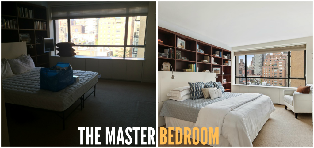
The Master Bedroom

Apartment Staging MBR

The bookshelves that surround the headboard and king size bed needed to become an architectural feature of this room – and it needed to feel like a master retreat.  Hotel style bed linens, a white dresser, and an oversized white leather chair were added and the shelves were organized to make the room feel fresh and welcoming.

________________________________________________________________________

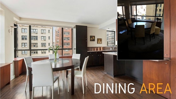
The Dining Area

Dining Area

Simply removing the round rug, cleaning the floors and swapping the gold chairs for white leather ones brightened and updated the dining area.  A vase with white calla lilies gave the finishing touch.

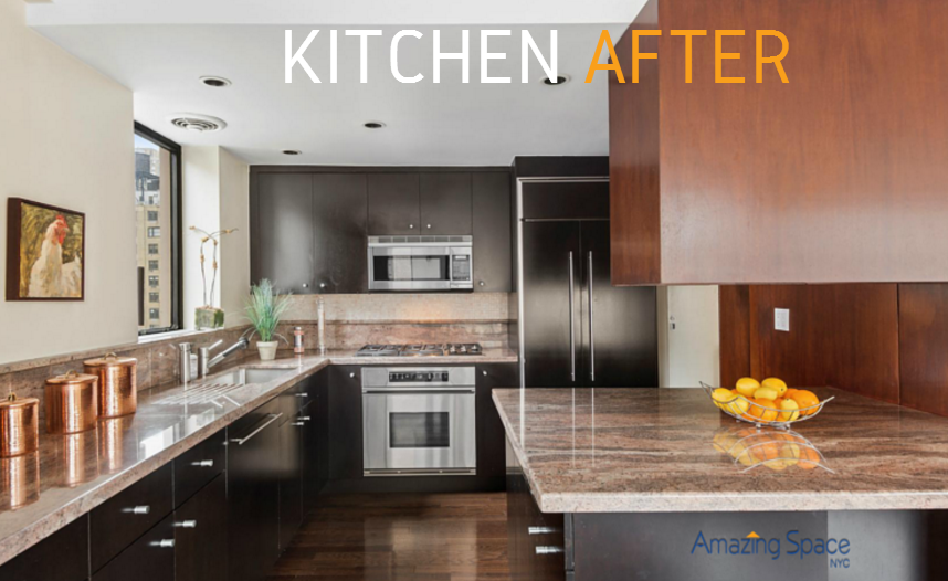
Apartment Staging

________________________________________________________________________

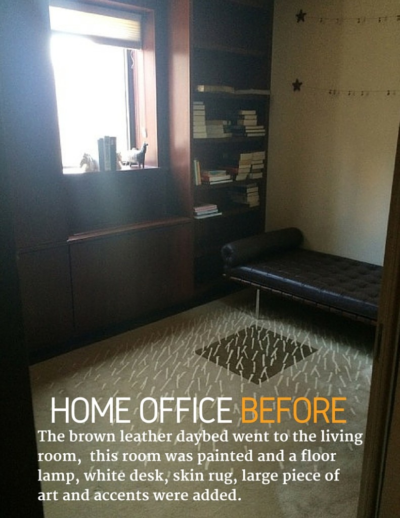
Home Office BeforeThe Home Office

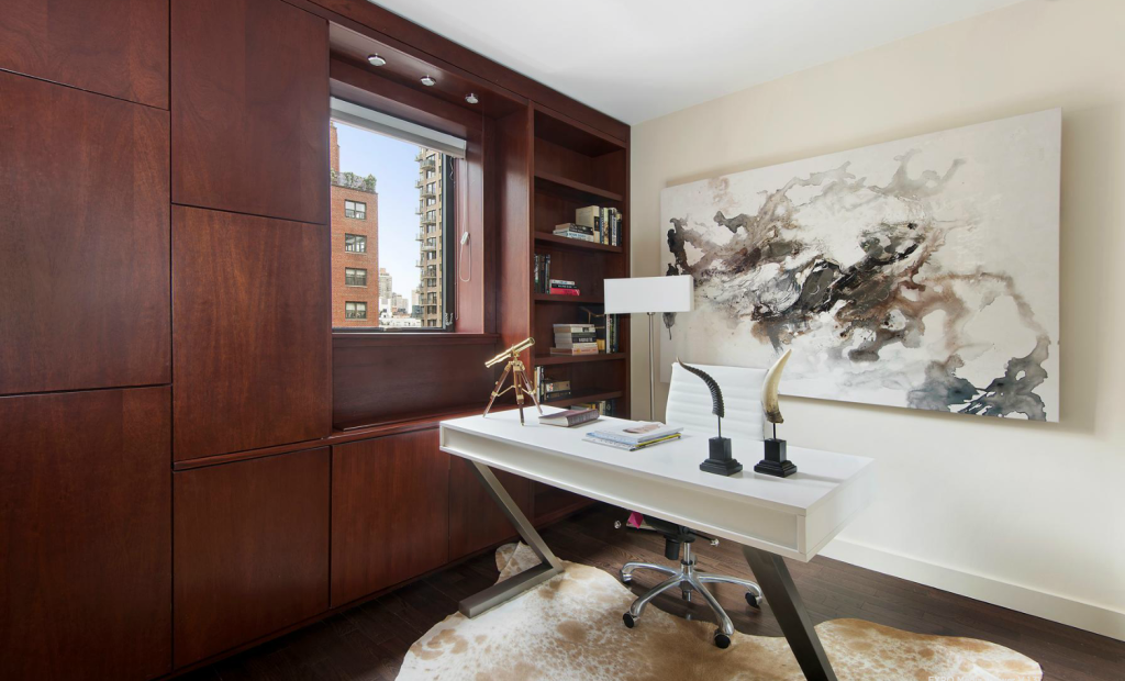
Apartment Staging This small 3rd bedroom is the prefect example.  I repurposed the brown leather daybed in the living room, creating a separate lounging area that faces the large gold sectional.  This room was painted and a floor lamp, white desk, skin rug, large piece of art and accents were added.

Now you can focus on the rich hardwood floors and the lush, rich cabinetry that turns this home office into a library, where you can plot world domination, world piece or just hone your version of the great American novel.

Apartment Staging in NYC Upper East Side

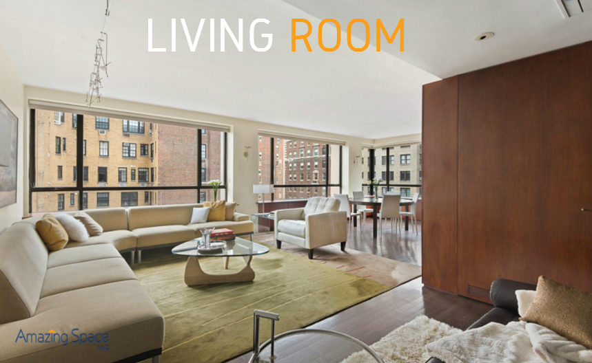
Once thoroughly cleaned, freshly painted and staged, with lighter furnishings, this residence woke up! We utilized many of the client’s current furnishings – notice the brown leather daybed that used to hug the home office wall is now floating in the living room, creating an additional seating area – and augmented the apartment staging with accessories and colorful punctuation (where appropriate).

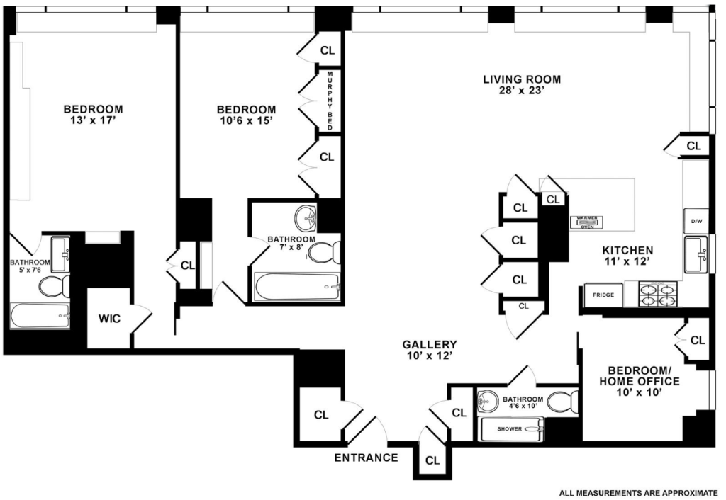
floorplan Listing Card


To explore apartment staging when you want to sell your co-op or condo, please call 917-428-3965 and ask for Debbie.

NYC Home Staging FAQs

Home staging like any industry has FAQs

When I consult with a real estate broker or a home owner on home staging their property, there are 3 questions I am prepared to answer, as at least one (if not all 3) are always on the “ask” list:

  1. How much will it cost?
  2. How quickly can it be done?
  3. Can you recommend and oversee the contractors and purchases (for projects that involve more than furniture)?

Home Staging FAQ: How Much Does It Cost?

This question is a tough one as there are a lot of variables that must be taken into consideration:

  1. The primary (and even secondary) target buyer’s lifestyle
  2. How would the buyer use each space in the property
  3. What will modestly yet stylishly illustrate “highest and best use” (a real estate axiom) within the context of our objective. (if there’s a game room or library, do we need to have more than one game on hand, or can a single chess set make the point?  Do we need a grand piano, guitar and violin or just a chair next to music stand to indicateMusic Room?)

These are the primary variables, then there is time on the market (we rent furniture and accessories for a 3 or 6 month term), which will also affect the overall cost.
NYC Home Staging


Another variable is how much work has to be done to the property to get the property market-ready.  When competing against new construction, the charm of old word details is lost when those details are crumbling, cracked and covered in 30 years of paint. All a buyer sees is ha$$le.  Dated appliances, lighting, carpeting can all cause a property to lag on the market while its neighbors are receiving multiple showings and offers.

Home Staging FAQ: How Quickly Can It Be Done?

I think my record is 2 weeks for a light renovation, furniture design, art sourcing and installation!  The sprawling apartment on the 27th floor in a full-service Carnegie Hill co-op looked fantastic when we completed the Staging, though it nearly killed us to pull all the components together in time for the launch!

Home Staging Ideas

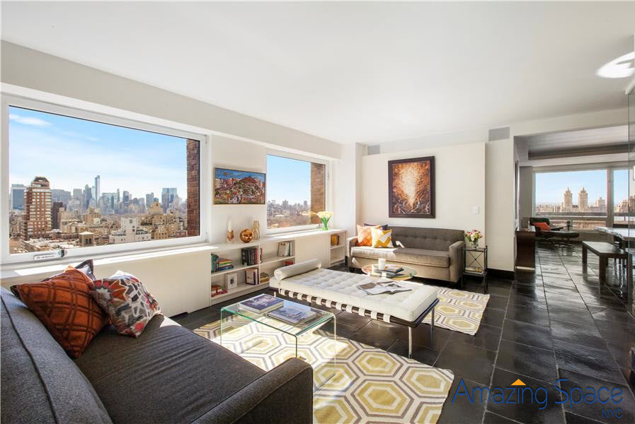
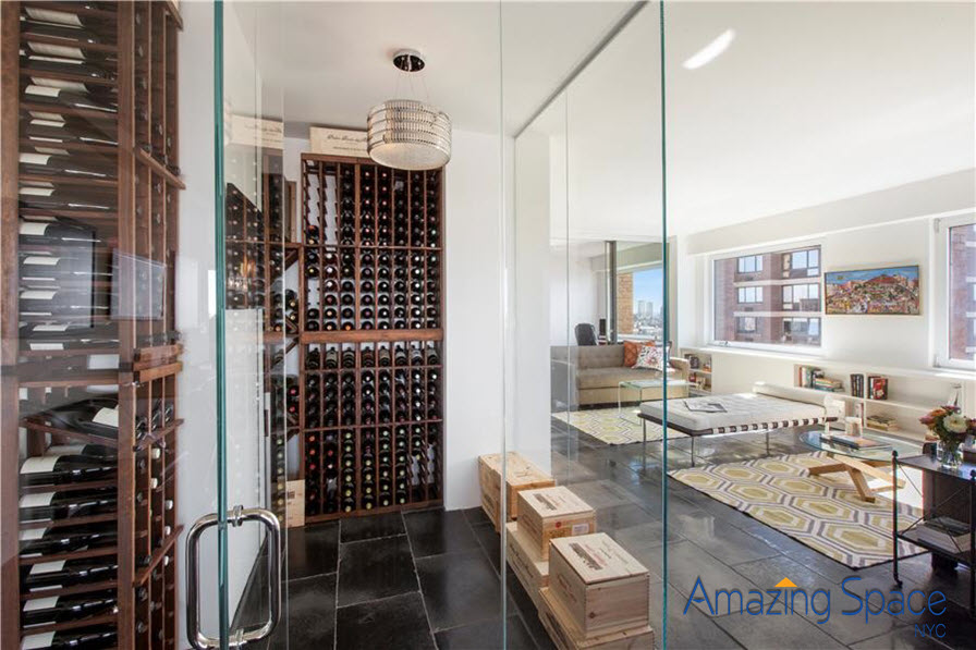
I think this is my favorite view:-

apartment staging by Debbie Oulvey has wine room


Home Staging FAQ: Can you recommend and oversee the contractors and purchases?

Yes.  I actually prefer handling the entire project from beginning to end.  It is simpler in many ways for me and much better for the Client. At this point, the home staging is the least of it. Managing the project – from securing insurance and alteration guidelines, coordinating freight elevator and deliveries, scheduling the work  – this can become very tedious and overwhelming.  My company is fully equipped to handle the prep work that might be required prior to placing any furniture, art or accessories into a property.

—————————————————————————–

If you would like your New York City Apartment home staged, please call 917-428-3965 and ask for lead designer, Debbie Oulvey.


NYNOW Summer 2015 – Design Trends Are Neutralizing!

NYNOW Design TrendsFor those of you who actually read my blogs, THANK YOU!

Here is my update on the SUMMER 2015 NY NOW show’s design trends that I’ve been teasing in my recent blogs. First, I must tell you that I went with my 12 year old daughter. I honestly was not sure what the result would be – do we ever know when it comes to 12 years olds? – but, unlike the Arch Digest Show, this trade show offers gifts, jewelry and BABY THINGS (and my daughter is obsessed with “all things baby” now that her cousin is PG). Three and a half hours later, we were still smiling and taking fun shots – and yes, collecting brochures on everything baby. Here is what I was able to absorb in between “the softest baby blankets ever”, bib buckets, and handmade wool stuffed animals.

2016 DESIGN TRENDS

1.  Metallics

Metallics are still visible although the number of vendors displaying their bling appears to have dropped this Summer. But decorative pillows, skin rugs, bedding, lighting and some accent furnishings still “shine bright like a diamond”.
Metallic Bedding Metallic Pillows

One of my favorite sources for decorative pillows is Ryan Studio and I am still a big fan after seeing their new collections at this show. Callisto caught my eye for their decorative pillows and throws.
2.  Animals

Animals are still a BIG emphasis in Home Decor. Sheepskin, cow hides, alpaca, rabbit, lamb’s wool were in abundance (and there was a booth with faux furs that looked SO real – I will have to make a trip back to Javitz to try on one of the ponchos – so cool). But I digress . . . . bean bags and rugs, pillows and throws. The soft texture mixed with the natural colors – this is a trend that is still very popular.

Fuax sheepskin is a strong design trend

3.  Color, as in NO Color

As for color trends, we did not experience deep, saturated colors as much as I saw in previous shows. I feel we are trending back to neutrals (which makes me VERY happy since I ordered a new sofa and 2 accent chairs for my apartment in neutral beiges and tans). The silk and wool rugs feature subdued patterns and tones – very elegant! This is one of those design trends that combines the organic movement with historical precedent and the blue-gray walls that have become almost classics nowadays.

Neutral Rugs

4.  Skulls

Of the more crazy design trends we saw, my daughter said I must mention the skulls – yes, they are STILL huge in decorative objects, art, pillows, wall-mounted sculptures. I am not sure I understand the obsessions but the trend is still alive (ha, no pun intended).  As a hard working NYC home stager, I’m unlikely to use these in any of my staging designs… Goth is small market segment and we tend to want to cast a wider net. As for Halloween…

Sometimes it just goes too far!5.  Cozying Up

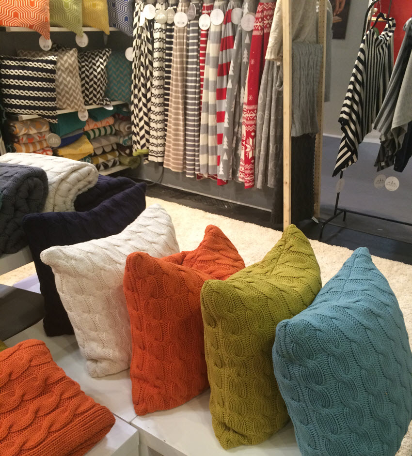
Perhaps it’s just winter coming, and how hard last winter was. But there were a lot of textile vendors offering pillows, throws and furniture specifically for snuggling into. Hunkering down with cable knits, soft cotton and furs were popular suggestions at many booths.  And it is here that we saw that formerly familiar pop of orange, the acid green and soft blues for all the girls who have invested heavily in mid-century modern and want to accessorize accordingly.

Cozy 2

Notice the metallic background for display! 🙂

The hunkering down cozying up design trend


Which is your favorite trend?


Pre NYNOW Trends Should Inform Stagers Of First Time Buyers.

NY Now Pre PlanningEvery summer, I drag myself through the heat and humidity to Javits Convention Center for NYNOW’s summer market. This year is August 16 – 19, 2015. It’s a huge convention center, filled to bursting with fresh, colorful ideas. Trends are laid out for you in glorious 3 dimensional technicolor and it. is. exhausting!  I love it. I completely love it, but I have to start working out for it months in advance.

Interesting, this year in the promotional materials they are talking a lot about the changing customer base in terms of lifestyle.  My ears pricked immediately. That is one of our signatures at Amazing Spaces NYC – home staging, yes, but more accurately, Lifestyle Marketing. Millenials’ more casual lifestyle (than their BabyBoomer parents) is altering the retail landscape.  Which one would expect, it’s just fun when everyone sits up and notices how.  How many Boomers do you know who are just now starting to downsize and finally stop acquiring things?  As the youngest of that generation sends their last kid off to college, a new era is emerging.  And, the more The Gift And Decor industry writes about the Millennials, the more I realize that this is vital intel for home stagers as we prepare homes for sale for younger or first time buyers.

Gifting Trends Derive From Millennials Lifestyle

Millennials are becoming known as the ‘Cut The Cord Generation’. Gone for them are phone wires, audio system cables, TV plugs, TV in general!  Since they carry their life and memories around on a phone, they don’t need or photo frames so much anymore.  In terms of gift giving, according to a recent study commissioned by Gift and Decorative Accessories magazine Picture Frames are becoming less popular, as are candles.

Home staging no nos for new buyers

To do a centerpiece of candles used to be pretty. Not so any longer. Now, an aromatherapy mister in the kitchen would be more on trend.

Toys, games and puzzles are popular again, as is anything handmade. It’s not just Panera excited about “Artisanal” – “Handmade” is huge. In fact, NYNOW will have a whole separate section on handmade items and exhibit hours specifically for that part of the Gift and Decor convention. 632 of the show’s 2,600+ exhibitors come from the Artisan space.

Trends in 2015 gift giving - wooden games


Other items trending are bar-ware. This is not surprising when you consider that the Millennials feel a strong affinity for the 50s, mid-century modern and all things ‘Mad Men’.  Cocktails and the stuff to stir, shake and pour are all the rage. Actually, is this particularly new?  Apparently it’s THE hot trend in giftware right now, but hasn’t Pottery Barn been selling these items since [their] Day One?

PB Tools and Accessories


When we think of first time buyers, we need to keep in mind, those folks are Millennials, and they’re a generation that is starting to be well-defined. They are starting to have enough of their own money that they set trends all by themselves.  Anything that appeals to them in general is what we should be staging with whenever they’re the target market.

Now, lest you worry whether I’ve incorporated any of these trends yet, let me remind you of a recent staging we had great success with –>

home staging success

Happy summer!  Looking forward to bringing you some sizzling ideas from #NYNOW.

Staging Is Not Just Furniture!

Home Staging NYC Estate Sale

When Amazing Space NYC arrived at this estate sale, there were bookcases in the living down one long wall. We knew the room would look bigger without them, so removed those bookcases. Only to reveal a wall that was not only discolored but crumbling in areas.

Staging is not just furniture; we had to let buyers see that this estate was not only loved and lived in but also maintained.  Buyers see cracks and crumbles and worry that there must be water damage from leaks.  We repaired the wall and made it part of the library / lounge side of the oversized living room. But at 31′ wide, this is a hard room to imagine usable. Where do you put your furniture, how do you furnish the double room so that it doesn’t just look like the place you sit in hotels when your room’s not ready.

Living Room

Other half of Living Room

Staging is not just furniture

Notice the unifying pops of orange.  Nothing too strident, but bold and fun.  As is the hide side chair.

In the foyer, we added transitional pieces, with a variety of art, typical of our intended target buyer.

Foyer

The dining room used to have Wedgewood blue trim and window frames with heavy blue toile or damask drapes.  We lightened up the room with a new paint job and allowed buyers to see out the windows and enjoy the natural light.

Formal Dining Room

125 East 72 Street 9D is now under contract. There was an accepted offer and a contract issued within 4 weeks of releasing the staged property. That deal fell through but another buyer jumped in shortly thereafter.

This is a great example of making the first rooms the buyers see create the tone, the mode, the “this is what the property can be  if . . . .”.  And it worked – again!

http://www.bhsusa.com/manhattan/upper-east-side/125-east-72nd-street/coop/10920325


Occupied Home Staging in the East Village

Owner-Occupied Home Staging Advice

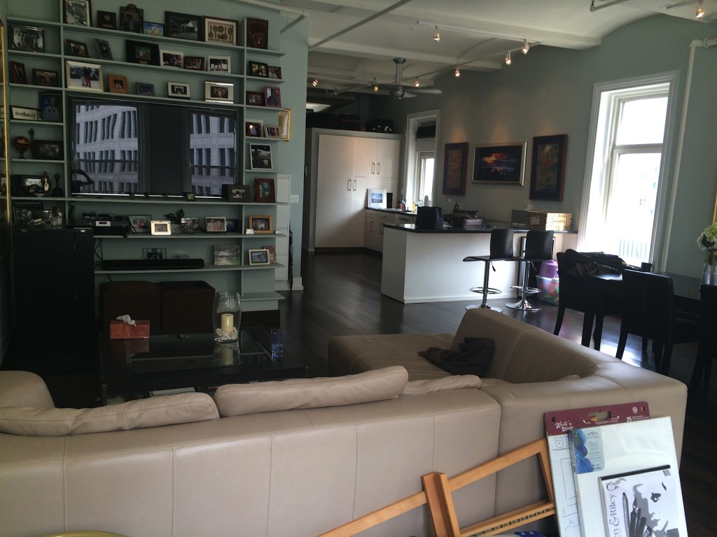
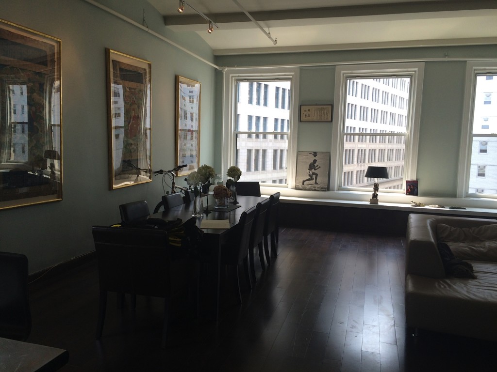
BEFORE, the living room and view, across the dining area, to the kitchen

This open-plan two bedroom apartment has soaring ceilings and exposed pipes, the perfect combination for people who want to live in the trendy East Village. With a wall of windows facing fourth Avenue, the main-living-entertaining space should be awash with light, sun streaming in at all hours of the day. Alas, that is not what welcomed us when we were called to this East Village property to prove an occupied home staging consultation.

occupied home staging consultation

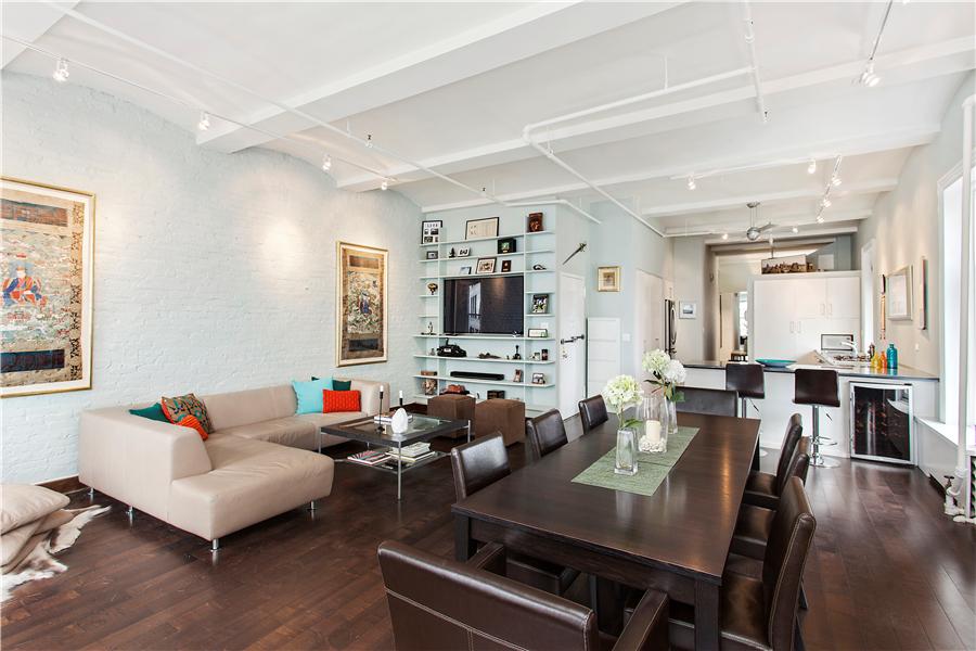
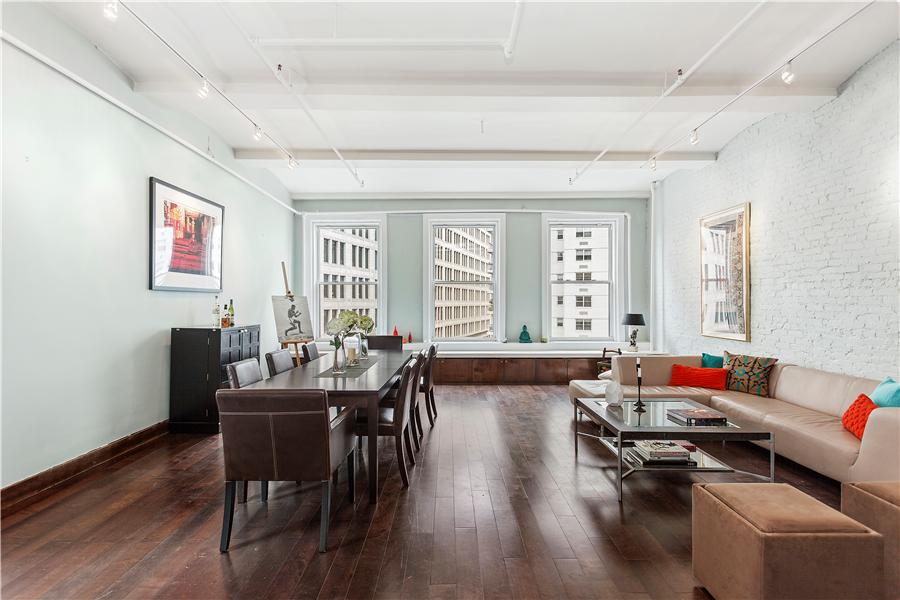
AFTER, the living room bookshelves are pruned back and the leather sectional repositioned to make the living area open to the dining area.

There were 6 oversized frames tapestries lining the walls.

apartment staging NYC

BEFORE – Yes, this is urban living, but storing a bicycle in the dining room just makes the apartment feel cluttered, cramped and not aspirational.

By reducing the framed tapestries to only two, buyers are able to focus on the exposed brick, the high ceilings and the large, open space itself.

NYC home staging

AFTER, the addition of a sideboard creates a more graceful entertaining layout. As for the bike, it finds its way to temporary out-of-sight lodging during showings!

For this occupied home staging plan, we rearranged the living room sectional which opened up the entertaining space and created a direct path to the dramatic wall of windows.

A thorough cleaning of the unit as well as fresh accents in the form of decorative pillows, vases and statues, bed linens, towels and candles added a well deserved layer of color and warmth to the rooms.

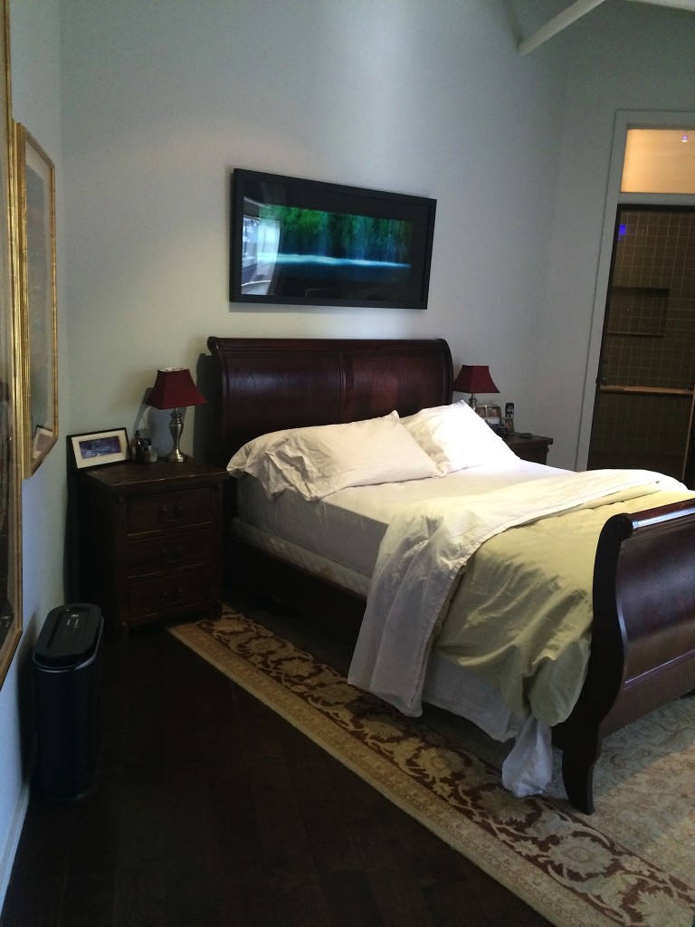
Master Bedroom

BEFORE – comfort trumps style

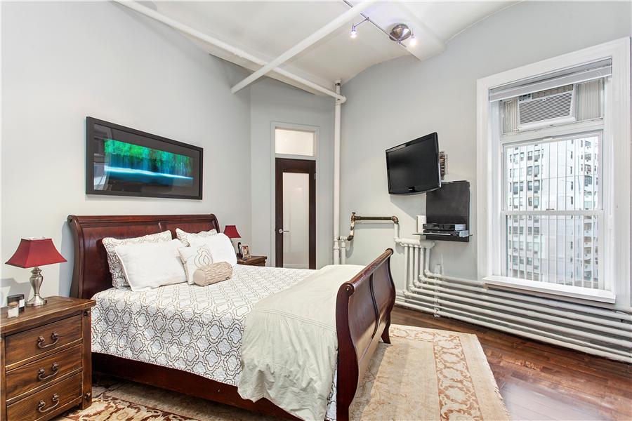
Master BR ndel

AFTER – comfort AND style prevail in glorious harmony!

Occupied Home Staging Tip

The challenge with an occupied home staging is devising a plan the homeowners can live with – for as long as it takes to sell the apartment. We think the key to a sustainable plan is to keep the layout as similar as possible but minimize the personality, the clutter, the particulars that take buyers’ focus away from the space.  Of course, the most difficult part is keeping the property tidy, clean and ready for an imminent visit from….your mother-in-law?  A seller who is serious about releasing his property understands. In the case of this East Village apartment, the seller cam home from a business trip and absolutely loved what we had created.  Thankfully, he still wants to sell it!

Whew.


Lifestyle Marketing Sells Condo Plus All Of The Contents!

Living Room Staged with Lifestyle Marketing

Photos used with permission from Brown Harris Stevens

A few years back, advanced home staging training programs started talking about Lifestyle Marketing. It was the anti-thesis of generally accepted staging principles. Simply, the concept is staging for one specific person, where home staging is preparing a home for sale to appeal  to the most people possible.  Surely you limit the potential buyer pool if you design for one person, what happens if they’re not in the market to buy a $3 million condo?  It’s a logical question.

However, niche marketing has been proven successful many times over. The narrower the niche, the better it works.  Consider how effective people find Facebook Ads, and the huge savings you get when you put your message in front of only the right audience. In many business situations, you don’t want every buyer, or even a lot of buyers, you just want the right buyer.  And that, sooner rather than later.  But don’t take my word for it, here are some other credible opinions:

Dining Area

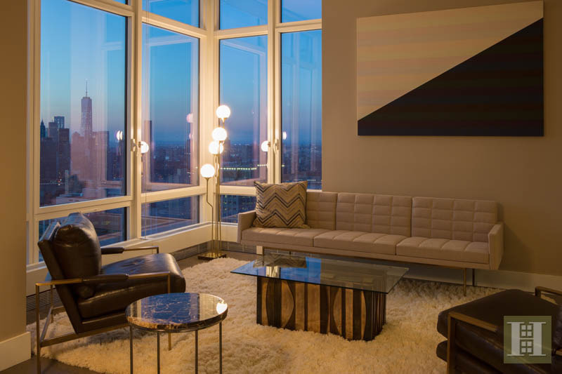
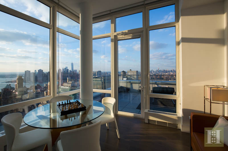
For this listing – 388 Bridge Street in Downtown Brooklyn – I listened carefully to the developer and the marketing/sales director as they said –

“Let’s position this unit for a bachelor with money.”

Aha, lifestyle marketing at its finest! We often apply this principle at Amazing Space NYC; it works very well for high-end listings where the buyer is often quite specific. More often than not, there just aren’t a wide pool of target buyers.

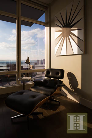
Here, we kept accessories to a minimum, opting for the kinds of things a busy, single guy might have around. Sleek, modern, efficient – for sure; and calming, soothing, a zen-like private space where he can scrutinize his strategy and plot his next move.


home staging nyc


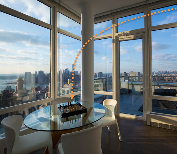
The city is laid out at his feet. Glorious light pours in day and night. It is a stunning set of views, comfortably at arms’ length. The owner here can feel high above the fray in this unit.

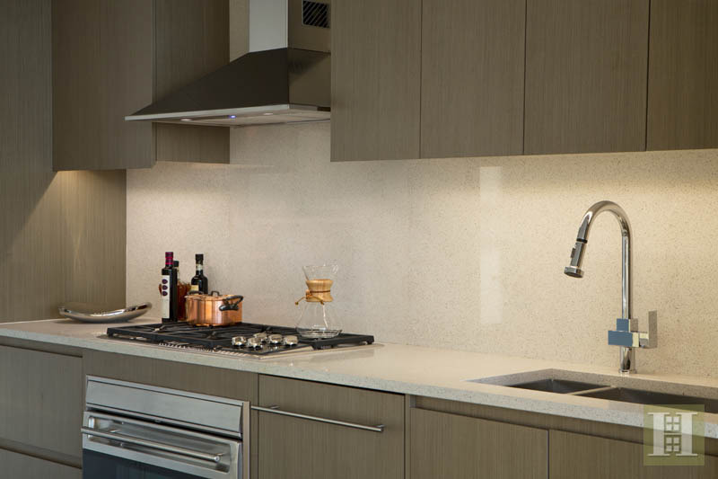
Kitchen Closeup

Should he want or need to cook, the space is there. And there are lots of cabinets for the juicer and whatever else goes into those guys’ gruesome morning shake.

And if there is a girl… or a friend…there’s a place for them on the deck. They shouldn’t get too comfortable though.  #Justsaying.

Lifestyle Marketing in living example


Our Lifestyle Marketing strategy worked.  A bachelor bought the pad, alright.  The buyer turns out to be a hedge fund executive.  And, he bought every piece of furniture, lighting and textile that we installed as part of our design.

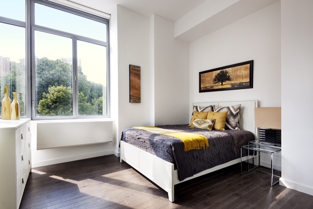
Duplex that sits on the park  . . .  and sits on the market without a sale.

BR 1

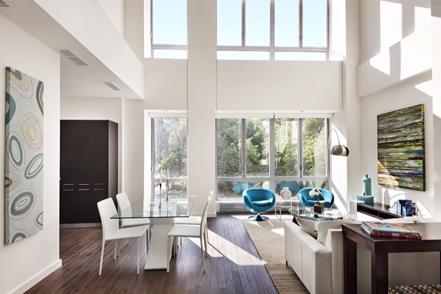
This duplex unit facing Morningside Park is one of the last 2 units to sell in the new development on the corner of Central Park North and Morningside Park.

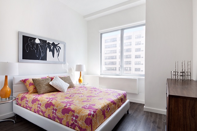
BR 2

Left empty, buyers were utterly lost as to how to position furniture in the bedrooms.  Square living displaces always cause confusion . . .  this one was no exception.  The broker successfully convinced the developer to stage this Unit so buyers could see the space’s possibilities and not the quirks.

home staging NYC


Playing off the green and blues from the park trees and sky, we transformed the main floor into the perfect place to lounge, dine and entertain.   On the upper level, we used properly scaled furniture to show how both bedrooms can accommodate the needs of a  single person, a couple or a family.  We anticipate a lot of traffic and interest for this duplex.

Home Staging Manhattan Valley

The building is also known as One Morningside Park. With views of  the park and the cathedral of John the Divine, it is a terrific, up and coming spot.

apartment staging nyc


It’s a low floor – #2A – asking $2.5 million. Yet it is beautifully renovated and a terrific space.